C&C per req:
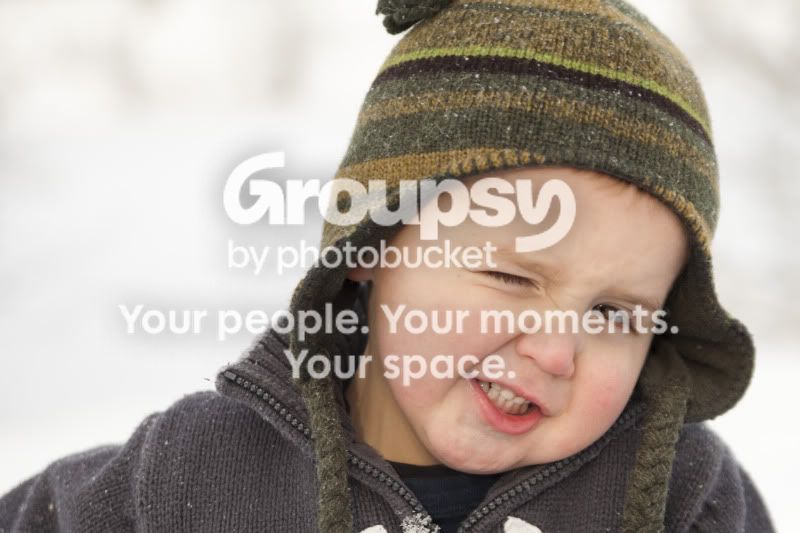
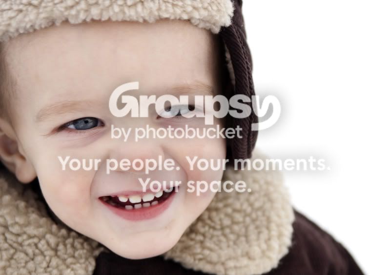
1. Technically the image is good, exposure, WB, etc. I'd prefer to see it cropped less tightly so that all of his toque was visible.
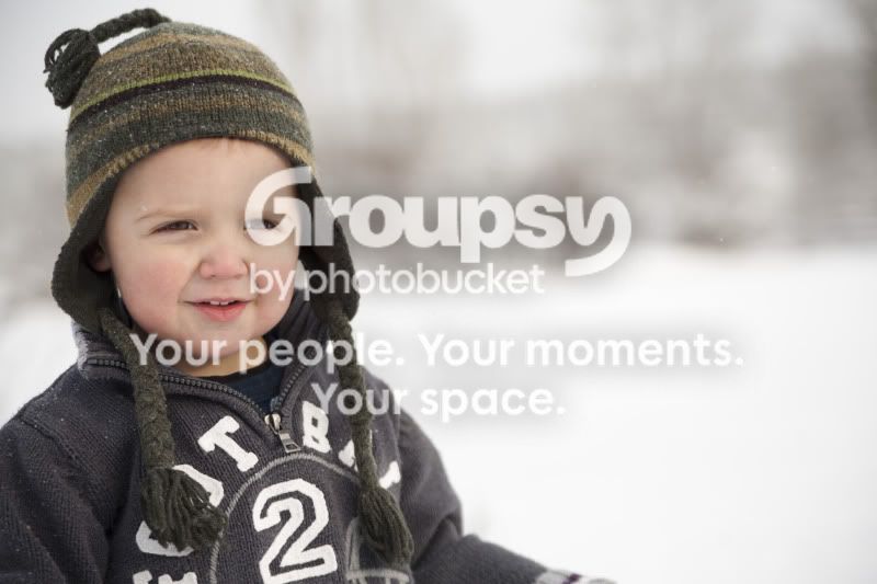
2. A little too much empty space image right. Perhaps crop about 1/3 of the blank space?
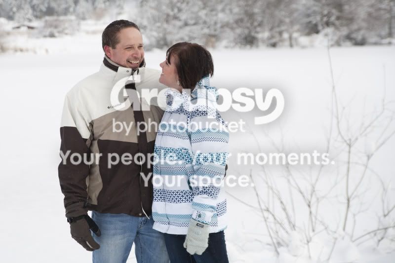
3. There's a reason that the vertical orientation is referred to as "portrait". You've got lots of empty space image left which does nothing for the image, yet you've cropped them at the waist. Also watch for background elements such as the tree growing out of the middle of his head! Children are can be difficult at the best of times, but in this case his expression really detracts from an otherwise nice image. Make sure you engage the child and attract his attention; almost anything is better than an unhappy look.
4. Again as per #3 with regard to orientation and empty/negative space in the image.
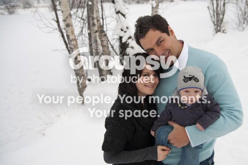
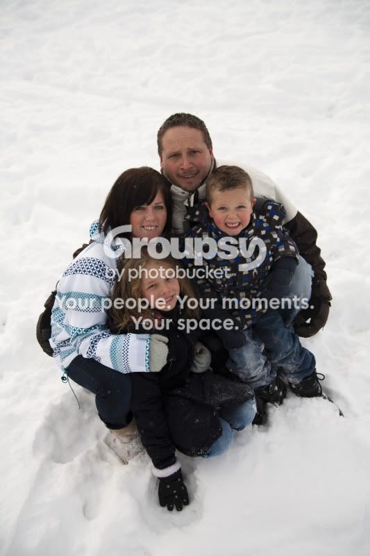
5.This one is the strongest of the group, but you really needed fill light here. A single speedlight image right, or even a reflector would have helped to reduce the under-exposure in the centre of the group. I'm not overly fussed about this pose, but it looks rather trendy I suppose.
6.Too tight and missed focus. Had you zoomed out just a little and ensured sharp focus on the whole face, you would have had a really nice image.
Overall, it's a nice set; you've done a good job of controlling the exposure in a difficult situation (shooting with snow is always a challenge).
Just my $00.02 worth - your mileage may vary.
~John

 I will definitely accept ANY pointers, and critiques!