What's new

Something different... C&C please

michael9000000

TPF Noob!
Joined
May 21, 2012
Messages
378
Reaction score
63
Location
Norfolk, VA
Can others edit my Photos
Photos OK to edit
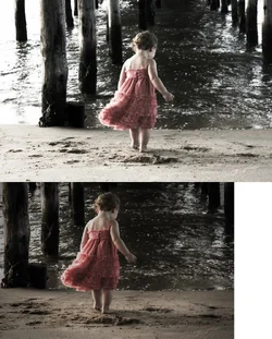
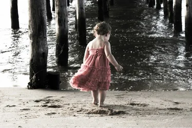
I typically try to keep my finished photos as natural looking as possible, so this is a total departure... Your thoughts?


$image-50250737.webp
 
I like it, your subject is centered but in this case works just fine.
 
Sometimes it's good to think outside the box and explore. Sometimes it works, sometimes it doesn't. Either way you learn and hopefully have fun. In this case, I think it worked. :-) Just my opinion.
 
Very sweet. Aren't kiddos fun to work with?
 
amandamartin said:
Very sweet. Aren't kiddos fun to work with?

Oh yes they are! At the age of 38, I'm blessed with a son who just turned 4, as well as IDENTICAL twin daughters who will turn 2 next month. 'My cup runneth over' with cute kiddos to shoot!

P.S. The little supermodel in this photo is not one of my daughters, but I had a blast photographing her nonetheless.
 
amandamartin said:
Very sweet. Aren't kiddos fun to work with?

Oh yes they are! At the age of 38, I'm blessed with a son who just turned 4, as well as IDENTICAL twin daughters who will turn 2 next month. 'My cup runneth over' with cute kiddos to shoot!

P.S. The little supermodel in this photo is not one of my daughters, but I had a blast photographing her nonetheless.


That's great! You are indeed blessed. I have an eight year old son and a four year old daughter, myself. My eight year old is a ham, but my daughter HATES taking pictures. In my experience, it's usually the boys who don't like it.
 
I like it. The only complaint I have is that I keep looking over to the left every time I look at it. It's bright and has that one pole out on it's own. It's distracting in my opinion. Other than that, I think it's great! :)
 
$image-50250737.webp

I made a few adjustments. The whole bright part on the left is distracting, so I removed it. Everything else was just bringing back detail from the highlights and adding some color. She's a cutie for sure!
 
That "improved version" is now clearly too dark, oddly framed (much more space below the legs than above the head) and less interesting than the original (there is already not much going on in the original. Simplifying it even more doesnt work for me).
 
I love it . . . my input would have been that you got a little lower to the ground to get the shot. The change in angle would have been interesting.
 

Create an account or login to comment

You must be a member in order to leave a comment

Create account

Create an account on our community. It's easy!

Log in

Already have an account? Log in here.

Back
Top Bottom