What's new

sometimes i forget

afoto

TPF Noob!
Joined
Apr 4, 2012
Messages
253
Reaction score
148
Location
Vancouver BC
Can others edit my Photos
Photos NOT OK to edit
sometimes i forget that the whole point of c&c is to improve. i often find myself posting my favourite images from a shoot.
i almost didn't post these because i wasn't really happy with them, but then it occurred to me, duh! you guys can help!

i feel like i sort of wasted this wonderful sunset, perhaps you guys could give me some ideas to improve?
i tend to be very minimalist in my landscape shots, so maybe i just don't like them because they are to busy, or maybe the overall composition isn't so good, or the subject matter just boring?
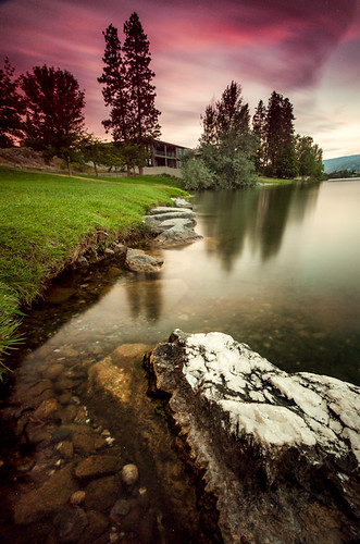


oliver02 by abbye dahl, on Flickr
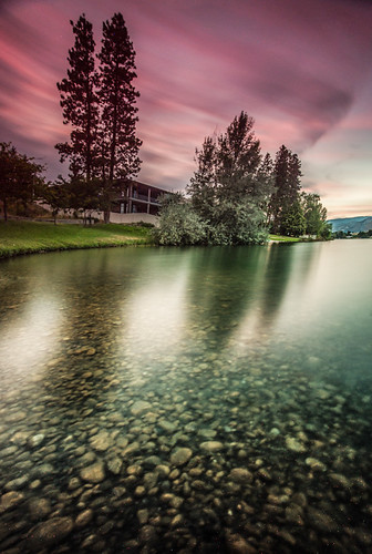

oliver03 by abbye dahl, on Flickr

 
The first one is pretty nice. The foreground rock points you into the image, and there's a strong line along the water that takes you to the sky and building. This area of the photo is weakest, it seems it's almost a stop underexposed. Something strange going on there. Looking on FlickR, I see some lost pixels, so you probably didn't expose adequately for the scene or something.

#2 I'd agree with you, the composition isn't super interesting. I'd probably prefer this one in landscape, with more coastline, judging from what I see in #1.
 
Both are nice! I really liked the sky!!
 
Abbye, I love your stuff, generally. These don’t have the same WOW factor. Well, let’s do the usual deconstruction and see where it gets us.

#1 – Three areas that attract immediate attention: Very bright reflection at cener, the white-tipped rock at lower right and the strong colour in the sky. My eye kinda hops between them and sees no commonality. The colour of the clouds is not mirrored in the water, so it is obvious some gelling or other colouration was done. The brightness of the grass at center somewhat is visually contradicted by the trees just past them that look like silhouettes. In summary, there are too many different components that are arguing with each other.

#2 – Same comment of sky colour and its reflection. For some reason the tree shadows don’t line up with the trees, but appeared to be skewed to the left. The sky in the center right fragment looks real, but the bulk of it, especially to the upper left does not. The linear shapes of the house tend to clash a little with the organic shapes elsewhere. In summary, a number of visual contradictions.
 
thank you guys, this really helps me out a lot!

oddly enough, this actually was the colour in the sky that night, why it wasn't reflected in the water i'm not sure..

but over all pgriz i agree, to much going on. i also had a big problem with noise on these images, i guess because it was so hot out?
 
thank you guys, this really helps me out a lot!

oddly enough, this actually was the colour in the sky that night, why it wasn't reflected in the water i'm not sure..

but over all pgriz i agree, to much going on. i also had a big problem with noise on these images, i guess because it was so hot out?

I like them... but they are not as nice as your usual stuff!
 
Last edited:
Try cropping just above the bottom rock in the first photo. This will give you a square crop/near square crop and the shore line will run from corner to corner. Not sure if you'll like it but I did when I scrolled down so that I could not see the rock at the bottom.
 

Create an account or login to comment

You must be a member in order to leave a comment

Create account

Create an account on our community. It's easy!

Log in

Already have an account? Log in here.

Back
Top Bottom