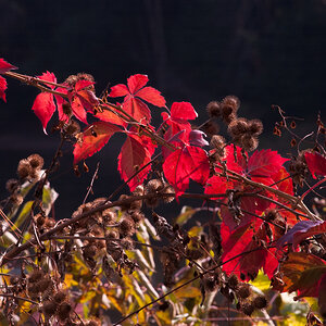
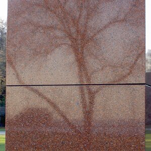
All right.
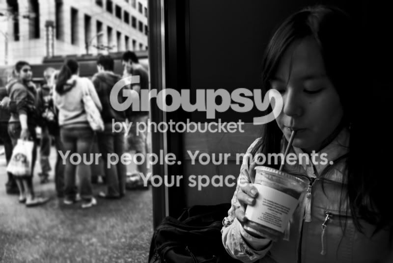
#1 is great...as if she's secretly indulging some guilty pleasure.
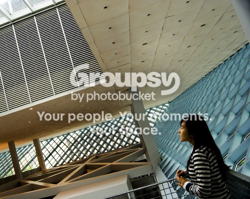
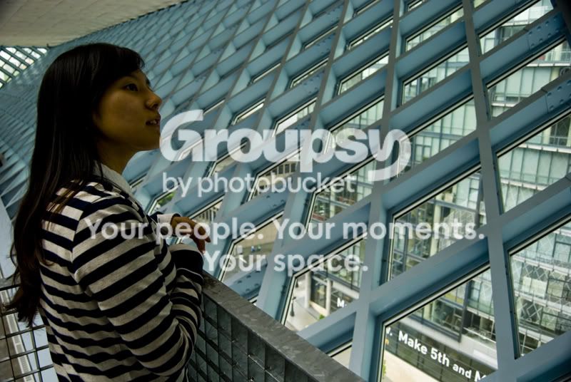
Composition and colors are right on in #2, except for the black area on the left. It clashes with the rest of the patterns, textures, and colors and is therefore distracting. It might be safe to crop it out.
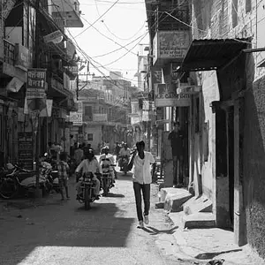
#3 is a nice stock sort of shot, though if that's what you're going for I think the colors ought to be a little cleaner. If not, what were you going for?






![[No title]](/data/xfmg/thumbnail/36/36303-10b1a386a9a00cf90fb7605d2d2c48c1.jpg?1734168634)

![[No title]](/data/xfmg/thumbnail/36/36302-6ee4929dfdf80290ffd73704693e860f.jpg?1734168631)


![[No title]](/data/xfmg/thumbnail/33/33450-b94d8a06a911e01c39df688c57b4745e.jpg?1734163488)