_jessicalynn_
TPF Noob!
- Joined
- Jul 26, 2012
- Messages
- 117
- Reaction score
- 31
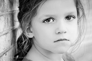
pgriz said:I'm not hard-core on the use of portrait orientation for faces. Yes, in most cases it is an appropriate format, but not always. In this image, I interpret the "subject" being the expression on the girl's face, and the horizontal format focuses my attention on the expression more than on the girl's portrait. The one nit I would pick is the appearance of her left cheek, with the way the hair comes around it gives an impression that she has something stuffed in that cheek. Now looked at carefully, it is apparent that she doesn't, but the image does create that illusion.
amolitor said:This sort of crop tends to give a kind of intensity to the portrait, which does suit the expression on the child's face here. The popped eyes and shallow depth of field also serve to bring our attention to the eyes, and increase that sense of intensity. The placement of the face in the frame is not traditional, the overall flow is left to right, and she is facing to the right rather than across the longer part of the frame. I am not sure what the effect of that is, but it's doing something.
Overall it works pretty well for me. The one oddity is the choice to make this intense and moody portrait of a small child. It's an unusual and slightly unsettling choice. We're used to pictures of kids being carefree and cheerful, and this one projects a sense of brooding. I'm not sure what to make of it. Is it a joke, as when the kid puts on her I Am Serious face and pretends to be all serious like a grownup? That's a perfectly good interpretation of this, I think. Is it something more genuinely serious? The fact that it's not quite clear why the serious face, the intensity, is what I find a trifle unsettling.
All that said, it's an image where all the elements seem to be pulling together, and it's an image that makes me ponder a bit. That's good enough for, it's all I really ask of any photograph.
So, well done!

CA_ said:I love landscape for portraits, it preventsthe photo from looking like it was done at Walmart.
This sort of crop tends to give a kind of intensity to the portrait, which does suit the expression on the child's face here. The popped eyes and shallow depth of field also serve to bring our attention to the eyes, and increase that sense of intensity. The placement of the face in the frame is not traditional, the overall flow is left to right, and she is facing to the right rather than across the longer part of the frame. I am not sure what the effect of that is, but it's doing something.
Overall it works pretty well for me. The one oddity is the choice to make this intense and moody portrait of a small child. It's an unusual and slightly unsettling choice. We're used to pictures of kids being carefree and cheerful, and this one projects a sense of brooding. I'm not sure what to make of it. Is it a joke, as when the kid puts on her I Am Serious face and pretends to be all serious like a grownup? That's a perfectly good interpretation of this, I think. Is it something more genuinely serious? The fact that it's not quite clear why the serious face, the intensity, is what I find a trifle unsettling.
All that said, it's an image where all the elements seem to be pulling together, and it's an image that makes me ponder a bit. That's good enough for, it's all I really ask of any photograph.
So, well done!