Well, Rick is on point, but let’s see if we can add to that.
The first one shows a bud. However, it is surrounded by similarly-toned vegetation, so we cannot see it’s shape easily, nor is there a separation between it and the surrounding material, leading to a visual mush. A technique that can be useful in these situations, is to use a very thin depth-of-field to keep our attention on the main subject, and throw into blur all the competing background and foreground.
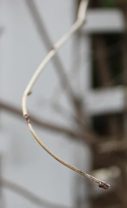
The second image seems to show a twig curving in towards us. It doesn’t have a lot of detail to hold our attention, and the background (light with strong dark blocks) overwhelm whatever attention we can muster to look at the twig. One of the lessons with this shot, is that the background/foreground can dramatically improve or ruin your attempt to direct our attention to the main subject.
In both cases, you need to identify what is interesting (to you) about these images, and then think about what you want us (your viewers) to get from the images. Nowadays, almost anyone using modern cameras can make decently exposed and reasonably-well focused pictures. The challenge is to convey an insight or feeling or observation that makes us want to look. Once you find what you want to convey, you also need to simplify so that there are no distracting elements.
I quoted Lew’s three-sentence prescription for better photos in my sig, because it is relevant and universally applicable. The “important things” is the stuff you want us to see. “Important places” is the position in the frame that allows us to feel a balance or urgency – this is what composition is about. His next sentence is about simplifying the image. His last sentence notes that there’s always some post-processing that is needed to make the image “sing”.
We all went (and are still going) through the process of learning to convey what we see in a way that's interesting to others. It's part of the journey.