You don't think it's an HDR?
It looks like an HDR to me. At any rate, the tonal range is handled oddly. The shadowed side of the wagon looks a little odd, with the sort of feeling of phantom light sources one gets from an HDR image. The sky looks overprocessed, and the colors are over-saturated, to my eye.
This is the style in some circles, and as an example of that it's fine work. It's simply not to my taste.
Composition is fine. The clutter at the edges of the frame left and right could be handled a little better, I think. Either give us a little more context, or go in a little tighter, I'd say, and above all make it look like you chose where the edge of the frame should be, rather than simply letting it fall someplace, unheeded.

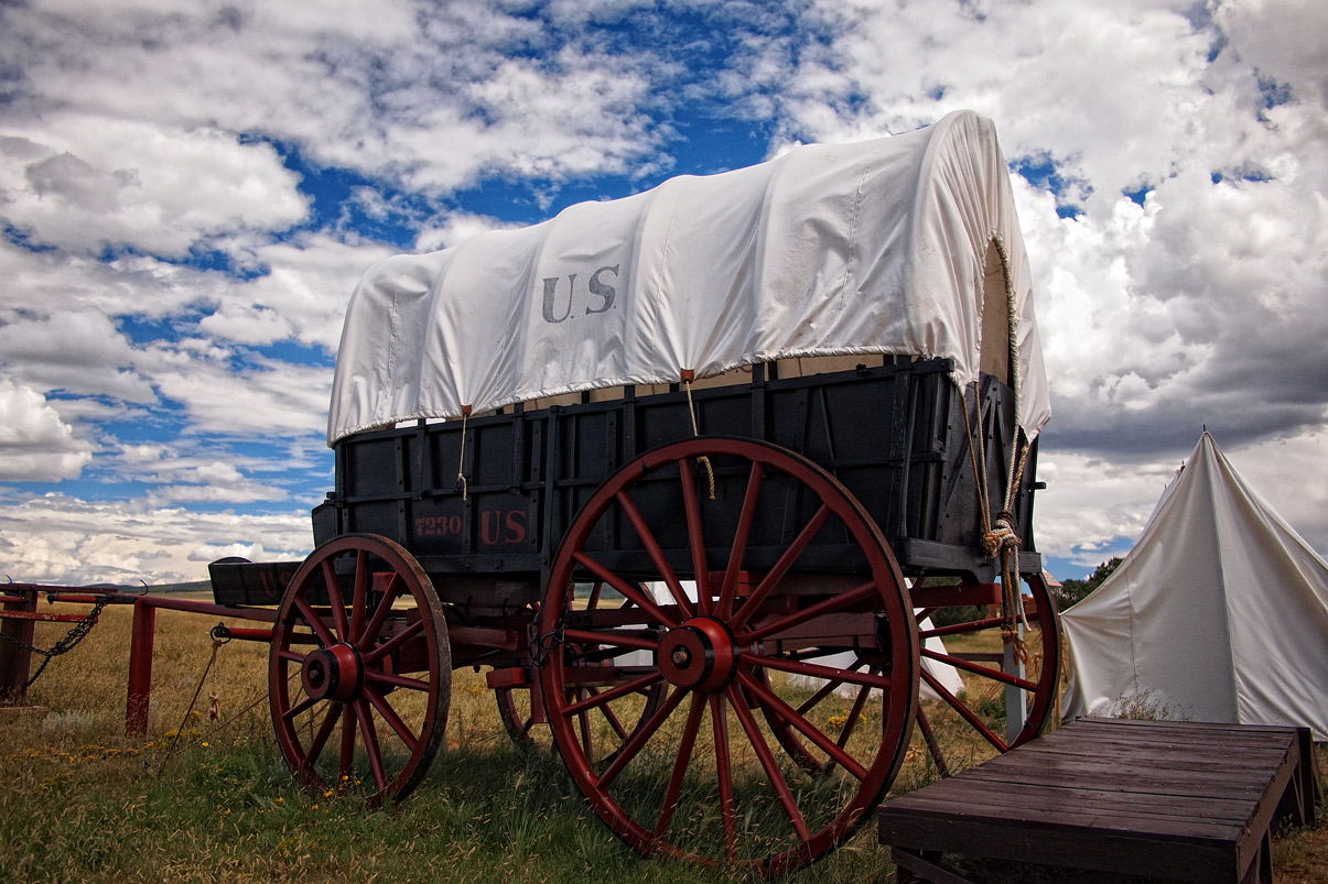


 I'm curious as to why you chose to shoot from the rear quarter instead of the front quarter.


![[No title]](/data/xfmg/thumbnail/37/37602-1ef8dbb1c2d0e4ff347ee65d328c3603.jpg?1734170730)