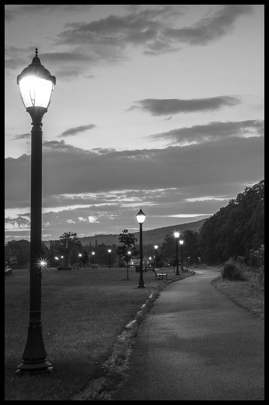
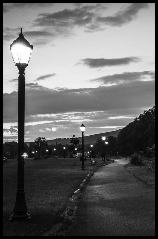
I realllllly like the sunburst effect on the distant light popping out of the side of the closest light pole--NICE! I have seen shots doen in this kind of lighting over the years, and usually like them. If I had a nit to pick, it would be that the contrast in the low tones could be a bit snappier...what I see are the slight pools of light the streetlights cast on the footpath...I wanna see the lawn and walk in-0between be a bit darker, and the light pools just a bit brighter, or more-contrasty. Just a little bit...not a lot.
In traditional B&W, we''d say, "I like the scene a lot, but I'd like to see it printed on 1/2 grade higher contrast paper."
") .
.


![[No title]](/data/xfmg/thumbnail/34/34059-47197a726f7089095bae50bfb77d8b1d.jpg?1734164477)


![[No title]](/data/xfmg/thumbnail/40/40356-883c642c8d24d2709b359f9c8b196fcf.jpg?1734174788)


![[No title]](/data/xfmg/thumbnail/33/33029-f4556b4c89cecbad12ebe6b782a51ef5.jpg?1734163040)

![[No title]](/data/xfmg/thumbnail/34/34058-276eb00b31d5bfacf4028e7f729dc601.jpg?1734164474)
