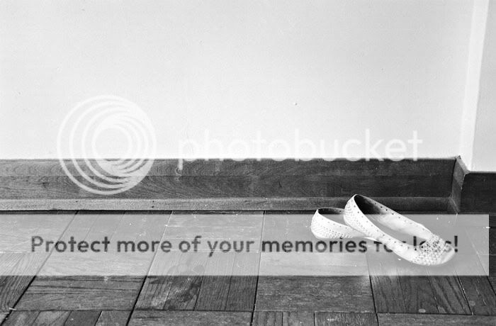
you have the same parquet flooring there as I do .. my shoes look different though
ok, lets get serious. there is some potential in this one, however I don't like the angles, which mostly the step in the wall being not perpendicular, but also not at any interesting angle.
Also the upper half is totaly empty /featureless which I do not like.
But remember, like and dislike is very subjective.
Also, I would not straight away know how to improve it. It is complicated to find a good perspective due to the simplicity of the scene
On this shot it would have looked good if you, stepted to the left and then maybe got down more then took a photo or... stepted to the left then went up then shot down at your visual.
I like the concept and the idea of going kind of minimalistic, with only one element and lots of empty space.
However I feel it does not do this photo so good that the majority of the empty space is bright.
Somehow I feel that if you had put yourself higher up and included more floor below the shoes and much, much less bright wall, they could have come out more. The brightness of the wall takes away from the brightness of the shoes. Those are my immediate thoughts.
This was scanned from an 8x10 print. My scanner seems to lighten whites and deepen the blacks sometimes, I don't know why. The print is much smoother tonally and has less contrast. The wall is also not as bright.
While I understand the reasoning behind all of your composition suggestions, which are much appreciated, BTW, I chose this one and like it. I do have several frames shot with different angles, as you guys have suggested, but there is just something pleasing about this one to me. It's all subjective....

")


![[No title]](/data/xfmg/thumbnail/35/35670-0571a45fff5cc94fc333fb959ce54517.jpg?1619737091)
![[No title]](/data/xfmg/thumbnail/38/38261-db20f6f92ee8f0d4c5cf1536e308638b.jpg?1619738546)


![[No title]](/data/xfmg/thumbnail/37/37618-4cd08d553e4ce30fd49570b1ba8259f2.jpg?1619738152)