stock/color correction check these pro pix

johnnyroc

TPF Noob!
Joined
Jul 24, 2006
Messages
17
Reaction score
0
these are my dream looks. I understand that to achieve these looks a lot has to do with talent and production design or what's in front of the camera.
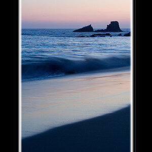
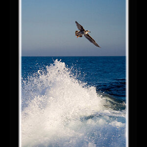
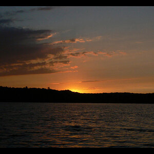
I'm mainly asking here about film stock and color correction. Ideally I would love to achieve these looks without PS. That would be amazing. I believe the first one is Chrome64?! I could be wrong. Anything else i need to know? lighting? yes i'm a beginner but won't stop until i can get close to these. My guess is all three use natural light. The second one was shot with a digital camera. I especially am interested in the top one. not composition but the look.
 
#1 just looks like a blown out snapshot to me. It's a little blue, but I would think 64T would be much more blue. #2 has probably had some blue added, because from the angle of the sun I'm sure the light was warmer in reality than in the photo. #3 just looks horrible. Is that a real live person or a manniquin? Dull lighting and the skin color is awful.
 
The second one may be taken with a still camera on set, or it might be a crop from a movie still. It's from "Lucía y el Sexo". I'm guessing the third one is a movie still also.

They do all look different to me. In the second one, the colors a higher contrast. In the third, it is rather dull and the colors are muted and off.

Can you describe what the "look" is that you see? One exercise that I found useful was to look through a lot of different types of images. For all the ones that really struck me, write down a bunch of simple descriptive elements. Things like color/b&w, shallow/deep DOF, low/high contrast, overall dark/medium/light image. This will be harder for beginners, since they aren't used to distinguished these things, but it can be done with some help. Once you have your list, count the total times each descriptor shows up. These are the elements of the style that you like, and you can use them in your own images.

Get a book like Bryan Peterson's "Learning to See Creatively" and go though each element he describes. He has a bunch of examples, so you can see what each involves and how they effect the image. This should help you when you are looking at other images to try and figure out what is being used.
 
that 'horrible' 'manniquin' photo is actually a still of Bridgette Bardot from Godard's 'Le Mepris'. I really like how it's muted an different from the glossy/poppy music video crap that's out there today.

yes, second one is from sex and lucia. I will definetely check out that book, thanks. But for now, i need to buy more film and not sure which one i need to get that muted 60's/70's look.

i'm shooting my first model this weekend with natural light and want be ready.
When you say blue added, do you mean in photoshop?
 
johnnyroc said:
i'm shooting my first model this weekend with natural light and want be ready. When you say blue added, do you mean in photoshop?

Or with a cooling filter (blue filter).

If you like the look of old movie stock you'll probably have to do it in PS. Overall the film industry has always been moving towards brighter, glossier, poppier colors or more accurate skin tones since it began. Notice the overwhelming popularity (not with me, but many others) of Velvia for the last several decades.
 
Mark, i ordered and read the book 'learning to see creativity' since your work looks impressive. What a complete waste of time. Wouldn't recommend it to anyone. it basically tries to teach people who do not belong to photography how to become talented. i understand composition very well and that's pretty much 90% of what that book is about. Lenses and composition.

my latest efforts:


Sorry you didn't like it. You mentioned that you were a beginner, so I thought it might be useful. Learning to see how the camera sees, in both composition and light, plays a big role in photography.
 

Most reactions

New Topics

Back
Top