themonko
TPF Noob!
- Joined
- Dec 27, 2004
- Messages
- 281
- Reaction score
- 2
- Location
- San Francisco, CA
- Website
- www.justinkorn.com
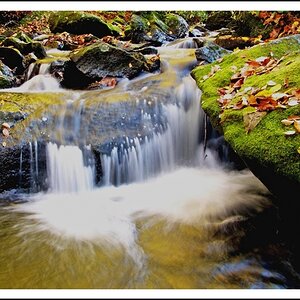
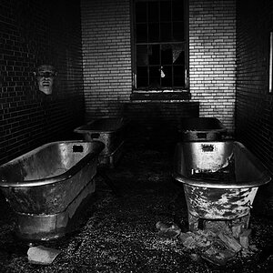
I have 2 questions...
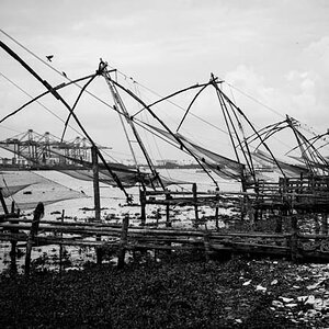
1) Which crop is better?
2) Is this shot even worth while?
Other critique?


Thanks!
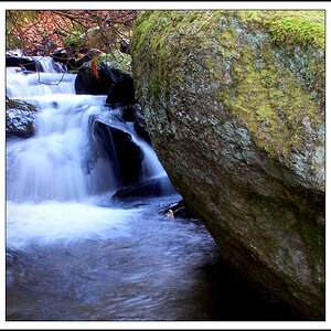
1) Which crop is better?
2) Is this shot even worth while?
Other critique?
Thanks!
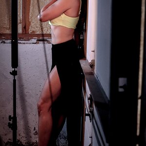
") That's the great thing about photography, someone "gets" something different from each photo.
That's the great thing about photography, someone "gets" something different from each photo. 
![[No title]](/data/xfmg/thumbnail/42/42451-9e2e4f1caad4c45d0c61e2a856140c36.jpg?1619740190)