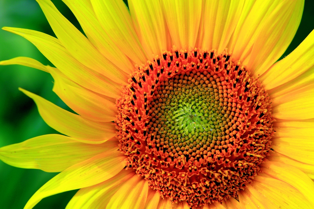
To me, there is too much green in the petals. Perhaps you have a different variety, but the ones I have seen all have solid yellow in the petals by the time they are open this far. Looking a little longer, it does bring the petals and green background together on the left side, but it still throws me a little.
To me, there is too much green in the petals. Perhaps you have a different variety, but the ones I have seen all have solid yellow in the petals by the time they are open this far. Looking a little longer, it does bring the petals and green background together on the left side, but it still throws me a little.
I fully agree with this. In fact, I think that the overall saturation is a bit too high.
Very nice image otherwise. The shape and position of the petals on the left is what makes this one succeed in my opinion. The orange being too close to the border doesn't bother me at all.
I think the saturation is what makes this photo. If those colors didn't reach out and "wow you", it would just be another sunflower photo and would lose a lot of punch.
Frequency has stated in one of my threads that he does, in fact, like a lot of saturation so I guess it's a matter of taste. I personally like it.
To me, there is too much green in the petals. Perhaps you have a different variety, but the ones I have seen all have solid yellow in the petals by the time they are open this far. Looking a little longer, it does bring the petals and green background together on the left side, but it still throws me a little.
To me, there is too much green in the petals. Perhaps you have a different variety, but the ones I have seen all have solid yellow in the petals by the time they are open this far. Looking a little longer, it does bring the petals and green background together on the left side, but it still throws me a little.
I fully agree with this. In fact, I think that the overall saturation is a bit too high.
Very nice image otherwise. The shape and position of the petals on the left is what makes this one succeed in my opinion. The orange being too close to the border doesn't bother me at all.
I think the saturation is what makes this photo. If those colors didn't reach out and "wow you", it would just be another sunflower photo and would lose a lot of punch.
Frequency has stated in one of my threads that he does, in fact, like a lot of saturation so I guess it's a matter of taste. I personally like it.






![[No title]](/data/xfmg/thumbnail/42/42397-30faa170de7ed9be38adf00b9b26a220.jpg?1734176928)

![[No title]](/data/xfmg/thumbnail/36/36421-843e629a8c32ff091e337e6880f0c323.jpg?1734168831)