Sunset C&C

Ankit

TPF Noob!
Joined
Feb 27, 2012
Messages
88
Reaction score
7
Location
Delhi, India
Can others edit my Photos
Photos OK to edit
DSC_0001.jpg
 
Last edited:
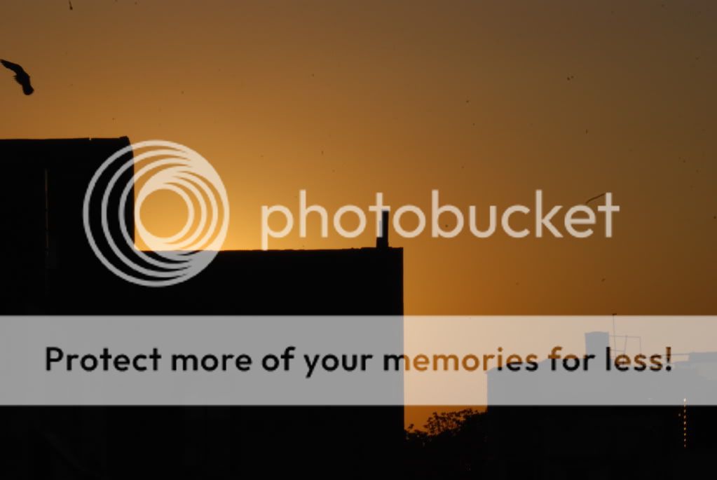
Not sure what the subject is here. You have LOTS of dust on your sensor.
 
Holy dust batman!

Unfortunately I don't really know what to critique. To me, it's just a silhouette with a massive amount of dust distracting the viewer.
 
Positives: interesting silhouette.. It almost looks like you've cut holes in the sunset. Nice colours

What I'd do different: I could have cropped to vertical by removing everything right of the big edge around the middle of the shot. I'd also take away enough to get rid of that thing in upper left corner (which I find distracting). I think that maybe would have made an interesting abstract.

This one has an abstract quality to it now, but I don't think it's "strong enough", if you get my point :)
 
Interesting colors and geometrics but for a photo, Sorry. Just too dull and fuzzy.
 
I can't quite tell what the subjects is. You said a sunset, so my mind is naturally going to look for a the sun, which is not visible in the frame.

What are you trying to go for here, something expiremental? I do find the black building interesting, but I still find myself trying to find the sun. I'm in no way trying to shoot you down for this photo, but I can't tell what you are going for.

Also, yes, your camera sensor and/or lens is very dirty.
 
My apologies for the dust.... yes i was going for the silhouette and thanks for c&c.
 
I didn’t like this photo. It was simply a silhouette of two buildings in a sunset that was not very beautiful. The photo seemed a bit bland, and the dust on the lens diminishes the quality.
 
Just not my cup of tea.

It's a sunset behind two basically boring buildings with a cloudless sky loaded with sensor dust, and what I think is one bird. Off to the extreme left is what looks like a street light, and on the building on the right, there is a group of vertical white dots, which I'm assuming are lights. Again, they're distracting. You chose to completely silhouette the two main buildings, but on the far right one can see a 3rd building which looks white.
 
You could clone out the messy bits :)

Overall, though, it has some nice tones/colours and extreme contrast :)

And maybe crop out the right side ?

I think it's an interesting pic that just needs some cropping/tweaking :)
 

Most reactions

Back
Top