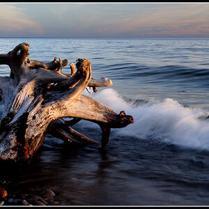
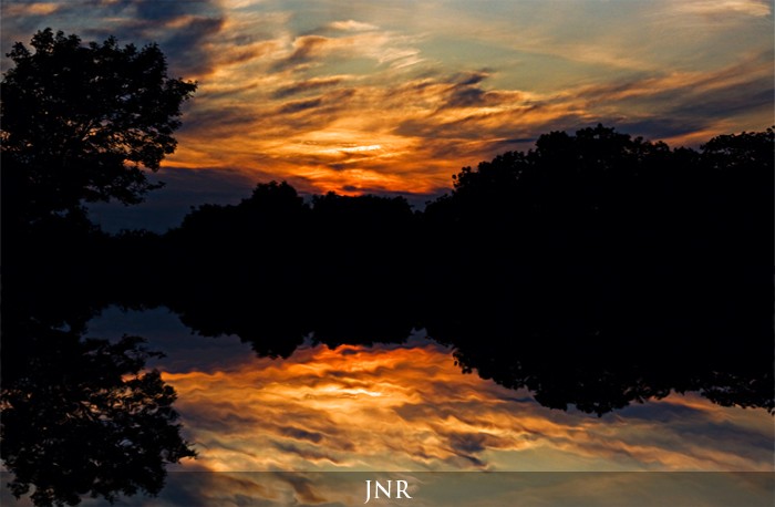
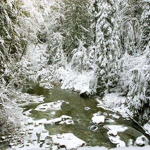
I don't care for it divided so evenly. The black shape draws a lot of attention to its symmetry. Once your eye sees the top and bottom are the same, there's nothing more for it.
I like it..great look and the composition is good..
What I don't like is the lack of definition at the shoreline......... in other words, it is slightly underexposed so that the silhouette looks more like a rorschach test than a scenic photograph..
Just for fun, try cropping it in half (crop the top half off) then flipping it. I bet that would be awesome.
Something like this. That's just a crappy screen capture that I rotated 180 degrees (you could rotate, or flip - depending on what side you want the tree to be on).

")
![[No title]](/data/xfmg/thumbnail/32/32164-d68fa2de02f9bef524bbd68aac2f12e4.jpg?1619735234)
![[No title]](/data/xfmg/thumbnail/32/32166-ddd2797e76a9226d289c2158c3cf7b67.jpg?1619735234)