What's new

Sweet child of mine (C & C welcome)

bingbang

No longer a newbie, moving up!
Joined
Jan 6, 2013
Messages
128
Reaction score
56
Location
Belgium
Can others edit my Photos
Photos OK to edit
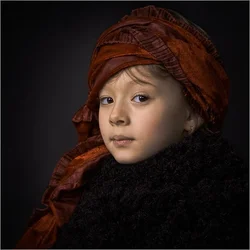
Trying new stuff and the old Dutch/Flemish painters style. Opinions are welcome

4YrukrQcLKP1neIihZ-wGnz5zm80zsagl7ui5DXIi9Ua=s600-no

On a black background :
https://plus.google.com/photos/+pat...5965845145110829794&oid=114391137842140117468​
 
Very nice! You've got the model, the pose, and the light. Now all you need to do is experiment with the editing to make it more "painterly". IMO
 
love it - beautiful beutiful model
 
VERY nicely done! My only [very] minor niggle would be to suggest that you shouldn't turn the head quite so far so that the iris is tight against the edge of the socket, but leave a bit of sclera visible.
 
I'd be very tempted to move the light around, so it is not coming in so directly from the front,. but is more raking across the face at an angle. To me, the angle of the light seems too straight-on for this kind of picture. I brought the image into Lightroom, to see what it looked like rendered in a darker style, to make it feel like an old painting from that oh-so-long-ago time.

.webp
 
Yes, it is not bad. May be a little too harsh for a little girl, but I get the idea. Thanks for the suggestion. BTW, if you have some information about how to render like a painting (in a subtle way), I will appreciate. I don't use much Photoshop.
 
Vey nice. I would suggest that a Dutch/Flamich painter would have probably chosen a different dress there. A dress that would not blend with the background and contrast with the face as much as it does here.
He would probabbly add a white collar to the composition or a white shirt, or white pages of a book, a white/lighter color flower or whatever white details that would widen the overall "dynamic range", prevent the face from being the lightest spot in the frame and therefore he would make the skin tones look more complementary and the whole composition more peaceful and comfortable. This one looks too edgy for an old Flamish or Dutch painting in my view due to the chosen color composition. Derrel tried to solve this problem the other way, and did a great job, but I am sure a wider brightness range would help more effectively.
 
Yes, right, but the shooting was not originally planned this way, this explain why the dress is not historically correct. It was the style that interested me, not much more.
 
Yes, it is not bad. May be a little too harsh for a little girl, but I get the idea. Thanks for the suggestion. BTW, if you have some information about how to render like a painting (in a subtle way), I will appreciate. I don't use much Photoshop.

I am not much of a Photoshop expert myself. I think maybe one way to make it look painting-like might be to "place" a texture onto the image as an overlay, and then use a blending mode to make it look like it was on canvas, and was a textured brush stroke image.

The edit I did was in Lightroom, and I just darkened the image down to put it into what I thought looked like a good "key" for such a subject matter. I realized she was dressed in a dark, knit sweater, or shawl or whatnot, so I let it go pretty dark. I think as the years pass, that this will be considered a very fine family portrait of your daughter.
 
Yes, right, but the shooting was not originally planned this way, this explain why the dress is not historically correct. It was the style that interested me, not much more.

Sure, do not get me wrong - it is a great photo. But I did not mean the historically correct drees, I was talking about the color/brightness rendition. If you watch old Dutch portraits you will often see some white details, like collars etc, and it is there for a reason: to avoid the face being the brightest spot.
 
@derrel : yes, texture, I thought about that, but I need to look at it. I am not used to make this. I will see.
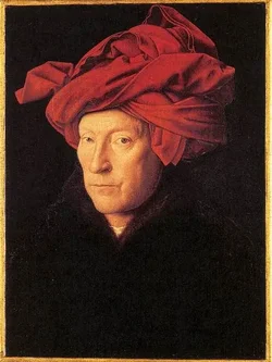
@sashbar : you remark is interesting, and I dig into the web. Here is what I found, a picture by Jan van Eyck. Amazingly, close to the same composition and colors.

$451px-Jan_van_Eyck_-_Man_in_a_Turban_-_WGA7597.webp
 
Last edited:
I'd be very tempted to move the light around, so it is not coming in so directly from the front,. but is more raking across the face at an angle. To me, the angle of the light seems too straight-on for this kind of picture. I brought the image into Lightroom, to see what it looked like rendered in a darker style, to make it feel like an old painting from that oh-so-long-ago time.

View attachment 63868


WOW Darrel you did a fantastic job!! What exactly did you do. I am playing around with light room right now to see if I want to buy it. I have always used photo shop. It is light room 5
 
First off I want to say that I think this is a FANTASTIC photo!! I really like what you did and I think with Darrels edit it really made it even better.

I took darels edit and I added some custom textures. Maybe this is something you may like. It does give it and older cracked painter look


Richs rework by VIPGraphX, on Flickr
 

Create an account or login to comment

You must be a member in order to leave a comment

Create account

Create an account on our community. It's easy!

Log in

Already have an account? Log in here.

Back
Top Bottom