Sweet Newborn

Lacey Anne

TPF Noob!
Joined
Mar 6, 2008
Messages
709
Reaction score
0
Location
WA state
Website
www.laceyanne.photoreflect.com
Can others edit my Photos
Photos OK to edit
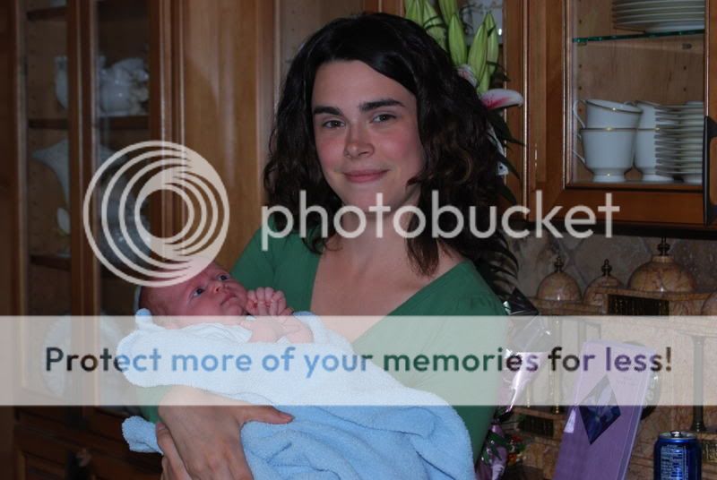
This was a spur of the moment shoot. I had offered to do newborn portraits for my cousin and she declined saying she'd just them done. Yesterday at our Mother's day get together she said, "Oh I should have taken you up on your offer. The photos didn't turn out well at all." I told her I'd quickly take a few since we were there and I had my camera. I had no gear besides my camera and lens but I think we did ok. In hindsight, I wish I'd varied the poses more. Well, C&C as always. Here's Baby King:

#1
DSC_0097-1.jpg


#2
DSC_00743.jpg


#3
DSC_00832.jpg


#4
DSC_00841.jpg


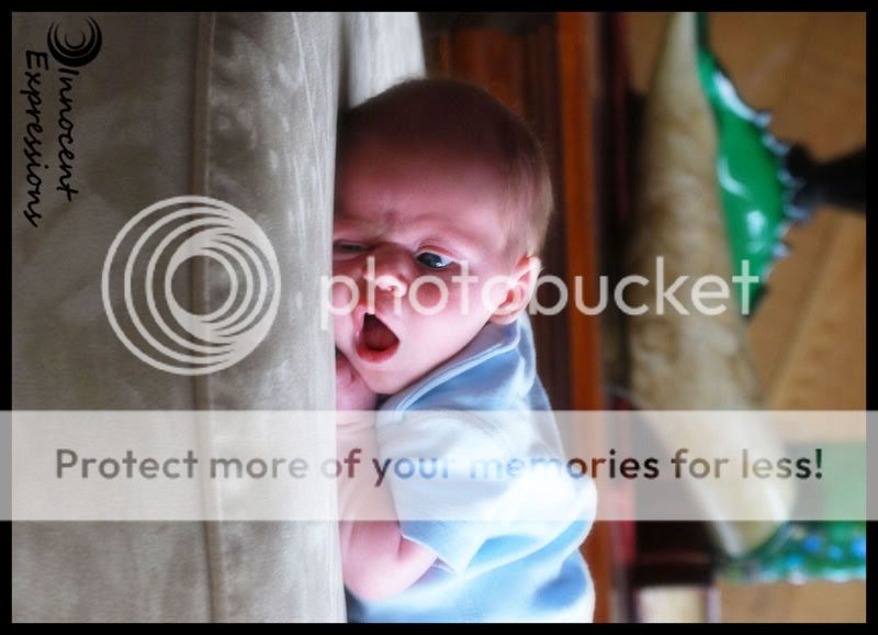
Oh, and I used all natural light from the windows.
 
#1 is the keeper here, I think, but try looking at it rotated 90 degrees CW. I liked it better that way. Nice DOF, but perhaps even a closer crop...closer to the top of the head, maybe? And something with the skin. There is some dryness I think could be smoothed out. Pretty good, though.

The light in the other 3 doesn't work for me.
 
I don’t normally reply to C&C requests as I still need more help than I can give but since you had to bump it I’ll offer my opinion. I think you did pretty well since you weren’t expecting to be taking newborn photos but they have a snap shot look to them. It’s hard to describe a 3-D environment but I would have positioned the baby facing the window more to flatten the light. Then get down low like you did. Vary your shooting position from shooting with the head at the foreground to the feet at the foreground. Moving in an arc you’ll get many different looks from the same pose.
I think compositionally the pictures suffer with the point of focus (the eyes) running down the middle of the frame.
I think I would like #4 the best if cropped from both the top and bottom. Reason the eyes are off center, nice soft focus and pleasant lighting without deep shadows.
 
I think the 1st one is the best and lowering in quality through each one down after that one. The 4th one has a cute expression but that background stuff is just too distracting. Plus the blown out highlights. I'm sure those could be forgiven if the this was cropped to elimate that background since the expression is so sweet!
 
I don’t normally reply to C&C requests as I still need more help than I can give but since you had to bump it I’ll offer my opinion. I think you did pretty well since you weren’t expecting to be taking newborn photos but they have a snap shot look to them. It’s hard to describe a 3-D environment but I would have positioned the baby facing the window more to flatten the light. Then get down low like you did. Vary your shooting position from shooting with the head at the foreground to the feet at the foreground. Moving in an arc you’ll get many different looks from the same pose.
I think compositionally the pictures suffer with the point of focus (the eyes) running down the middle of the frame.
I think I would like #4 the best if cropped from both the top and bottom. Reason the eyes are off center, nice soft focus and pleasant lighting without deep shadows.
Thanks for the critique. I appreciate all the lighting tips.
 
I think the 1st one is the best and lowering in quality through each one down after that one. The 4th one has a cute expression but that background stuff is just too distracting. Plus the blown out highlights. I'm sure those could be forgiven if the this was cropped to elimate that background since the expression is so sweet!
See, now I really liked the background on the last one. I loved the green. I've gone back and played with cropping it and I just can't get it to look quite right. I thought the background was interesting but maybe it's just distracting from the main focus which is baby. And the highlights... I'm weird. I LOVE blown highlights on newborn shots. I don't even know why! lol! But yes, they are blown. Thanks for the critique. I've thought about it a lot over the last day or so. You definately gave me some great thoughts to ponder.
 
I think the 1st one is the best and lowering in quality through each one down after that one. The 4th one has a cute expression but that background stuff is just too distracting. Plus the blown out highlights. I'm sure those could be forgiven if the this was cropped to elimate that background since the expression is so sweet!

I too was going to mention this. It is a cute shot, but the background takes so much focus away from the baby. Cropping would do wonders.
 

Most reactions

New Topics

Back
Top