Tear me to pieces, let me know what you think

First one has too much sky, which obviously is not the subject.

The second suffers for Subject Identity Crisis. Is the subject the sky, or the berries? The entire image seems out-of-focus to me.
 
I think the 2nd one has too much sky showing, maybe crop some sky off, Just my opinion. Nice shot thought"

The 1st one I don't know if it is me and my computer or my Old Eyes, looks a little out of focus.

All in all I think a nice job.
 
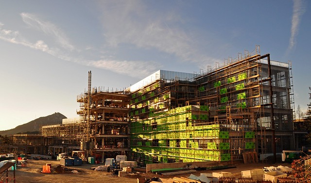
#1 I like the light color and direction. I like that even though it's a very chaotic scene, there is still some organization to it. I feel like I'm seeing too much sky and not enough area below the structure. The sky doesn't add to the scene for me, but seeing all the other contruction related clutter at the bottom does.... or would if it were there.

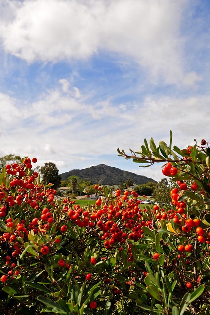
#2 The composition is centered around a mountain, but the mountain, at least as it's portrayed here, isn't a very strong subject. It's the same color as the foliage, it's small in the frame, and it's quite dark in tone compared to the berries and the sky. I think you could have done better to shoot with a longer lens so the mountain would be larger in the frame. You would need to choose a different area of berries though as the mountain would no longer fit in the natural frame you have here.

Secondly, I generally prefer portrait crop for landscapes, but here I don't think it's helping. You could get the mountain to be larger with a landscape crop. The red berries are strong and can stand up well, but the sky, even with the clouds, is pretty weak imo and I'd either like to see less of it, or more dramatic light.
 
I don't shoot landscapes but I'll throw in my .02 worth. I like #1, it reminds me of the 3D graffiti work by Daim (look him up) but I also find it cluttered.
#2 I like a lot. The sky seems over exposed. Bring out that blue
 
Wow, I guess inviting people to not hold back is the key to getting responses on TPF, good to know.

I did what I could with what I had. I wanted to show more at the bottom of the first photo, but all it would have been was the stairs and walls of the building I was in/on when I took the shot. I actually cropped a little bit of fence and another building from the bottom of the image. I see what you guys mean by there being too much sky.

I have had a hard time deciding if I like the second shot. I was walking to work, saw the hole in the bush, framed the mountain, and fired off a couple frames. I wish I could make the mountain larger with a longer lens, but all I have is my 18-55. I actually did darken the sky and increase the blue already, so I guess I was on the right track. I did darken the mountain a little bit, because I thought that it blended in with the sky too much. I see now how it blends in with the bush, though.

Thanks!
 
It's not so much that it blends into the foliage, but it's that it's the same color and a similar tone. There are several things working against it.... alone, each of these might not be a big deal, but together, they are a real problem.

#1. It's small in the frame.
#2. It's dark and dull, surrounded by light sky and bright colored berries.
#3. It lacks contrast (same tone, flat lighting, no texture or depth).

Compare this to the berries...

#1. Take up a lot of the frame.
#2. Bright, colorful, and contrasty! Side-lit for depth.
#3 Very contrasty.

Compare this to the sky...

#1 Takes even more of the frame.
#2 Bright, somewhat colorful.
#3 Full of interesting shapes.

The subject is visually the least attractive part of the image. It's interest is getting NUKED by those bright red berries and the bright sky.
 
Just messin':

r9ieqq.jpg
 
I looked at the first one at the fullsize in Flickr and there are two things that really are obvious.
First, although the geometric structure gives teh impression of sharpness, it isn't and sharpness is a big factor in these shots.
Second, the verticals are badly distorted and I think those need to be corrected for the picture to succeed.

Lew
 

Most reactions

Back
Top