What's new

Test Modeling Pics...C&C Please

AtuspidsGoddess

TPF Noob!
Joined
Mar 6, 2011
Messages
247
Reaction score
13
Location
Twin Cities
Can others edit my Photos
Photos OK to edit
Did a practice shoot for fun...always looking for better ways to improve my skills...C&C greatly appreciated!

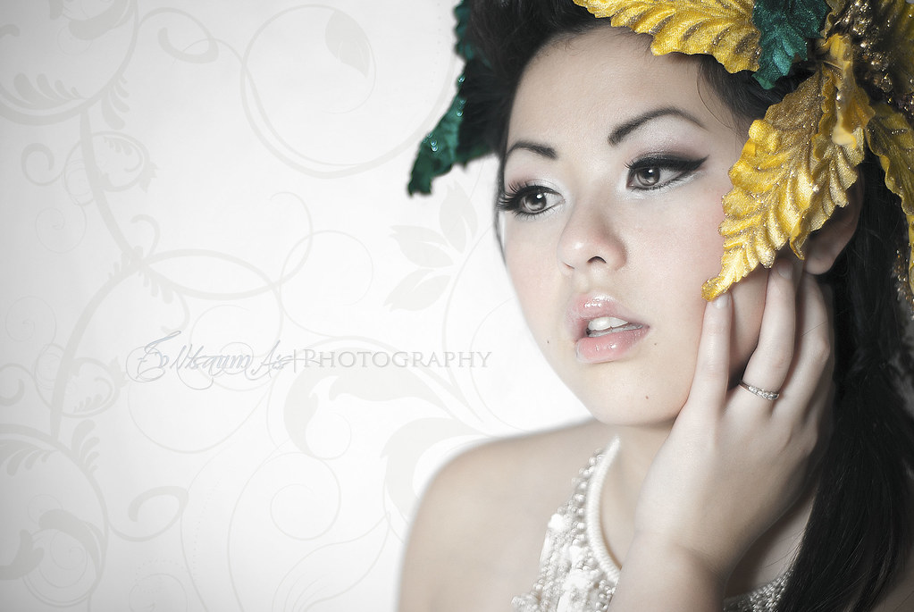
1.

5356044628_f47c20201f_b.jpg


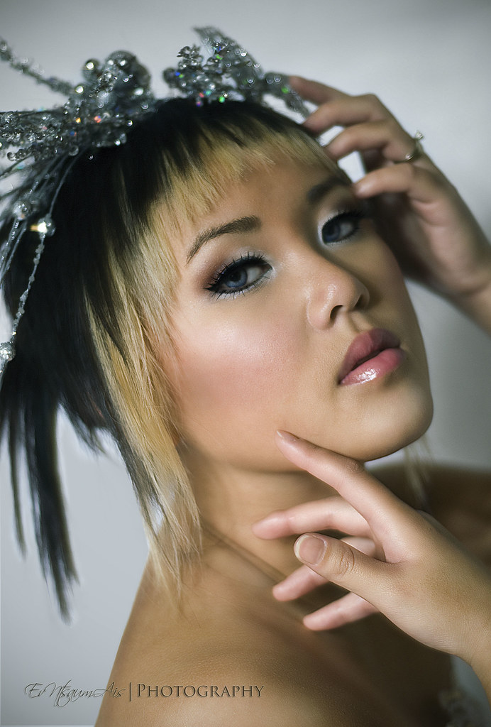
2. Should I have cropped this one?

5176929388_5872e26ff3_b.jpg


3.

5176731893_9fe9a89b2a_b.jpg
 
I love #1 IMO it is the best out of the 3.
# 2 is nice and IMO I dont think it needs to be cropped.
#3 Im not dig'n I dont know if its the pose or maybe it is the postion of her hands?
Nice work. Thanks for sharing.
 
Overall a nice set!

1) The strongest of the three IMO. I don't know what your skin smoothing/sharpening work flow is, but it looks to me like you smoothed/didn't sharpen the eyebrows. Or maybe it's just a function of the makeup? Either way, the yellow of the hairpiece seems very crisp, yet the rest of the face is so smooth that at first glance it suggests to me that focus was missed and is only on the hairpiece and not the eyes. Looking more closely I can see that the eyes seem to be sharp. So if the depth of field includes everything from the yellow of the hairpiece to the far (her right) eye, then the eyebrows should be expected to be sharp as well.

2) I like this one and agree that I don't see a different crop working well. I do notice some haloing around the hair (lower left corner) - I'm guessing you did some work on the background, maybe cleaning up some stray hairs? This shot might have benefited from just a touch more light from camera right onto her face and far hand - the different lighting levels on the two hands, in combination with the crop (ouch, just noticed the cropping at the wrist!), give it a somewhat disjointed feel, almost as if the hands come from two different people.

3) The hand position isn't doing much for me...I think a tighter crop might help with that (just my preference). The lighting here again leaves me feeling like the image is a bit disjointed. On the left side (well lit) you have the upper hand, face, lower hand and neck/shoulder. On the right side (much darker) you have the forearm, then upper arm and upper chest. Maybe it's because of the hair coming down from under her chin to the bottom of the frame, but the way the lighting and the depth of focus fall together these two areas could almost pass for different bodies.

 
fantastic all around!
My only issue is with the top hand in #3
 
#1 is beautiful, definitely my fav! I agree about #3, something about the position of her hands doesn't sit right. It doesn't look very "natural."

Good job! :)
 
Thanks for all the C&C everyone....will definitely keep those suggestions in mind as I try to improve.
 
Overall a nice set!

1) The strongest of the three IMO. I don't know what your skin smoothing/sharpening work flow is, but it looks to me like you smoothed/didn't sharpen the eyebrows. Or maybe it's just a function of the makeup? Either way, the yellow of the hairpiece seems very crisp, yet the rest of the face is so smooth that at first glance it suggests to me that focus was missed and is only on the hairpiece and not the eyes. Looking more closely I can see that the eyes seem to be sharp. So if the depth of field includes everything from the yellow of the hairpiece to the far (her right) eye, then the eyebrows should be expected to be sharp as well.

2) I like this one and agree that I don't see a different crop working well. I do notice some haloing around the hair (lower left corner) - I'm guessing you did some work on the background, maybe cleaning up some stray hairs? This shot might have benefited from just a touch more light from camera right onto her face and far hand - the different lighting levels on the two hands, in combination with the crop (ouch, just noticed the cropping at the wrist!), give it a somewhat disjointed feel, almost as if the hands come from two different people.

3) The hand position isn't doing much for me...I think a tighter crop might help with that (just my preference). The lighting here again leaves me feeling like the image is a bit disjointed. On the left side (well lit) you have the upper hand, face, lower hand and neck/shoulder. On the right side (much darker) you have the forearm, then upper arm and upper chest. Maybe it's because of the hair coming down from under her chin to the bottom of the frame, but the way the lighting and the depth of focus fall together these two areas could almost pass for different bodies.

Maybe I'll try a tighter crop on that last one cause I also feel rather weird on the hands...

On the first one...I'll have to check that eyebrow...I agree it should be sharp/crisp as well.
 
I like #3. Those make me think of fashion shots and fashion models often strike poses that don't look very natural. To me at least. So the pose in yours doesn't bother me one bit. I would however not have cropped at the wrist. Having a bit of the arm in the frame would make the hand look slimmer, I think.

#1 the background bothers me. I feel like i'm looking at wallpaper that was blown. I'd like to see the design through the whole area.
 

Create an account or login to comment

You must be a member in order to leave a comment

Create account

Create an account on our community. It's easy!

Log in

Already have an account? Log in here.

Back
Top Bottom