THANK YOU - and please C&C

Rosy

No longer a newbie, moving up!
Joined
May 9, 2011
Messages
1,289
Reaction score
328
Location
Raleigh NC
Can others edit my Photos
Photos OK to edit
When i first joined TPF I was totally shocked at the hard critique. As time went by more and more I realized that those of you that offer a fair and honest response are taking time from your day to help someone else.
THANK YOU

OK - after MY site was blasted to another dimension I have made the vow to post a weekly image with the goal of improvement!!


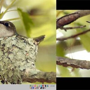
Tcap Site Image-38 by casualapproach, on Flickr
 
Might just be me, but I think the above image is better then what you had on your site.
 
Rosy, let me first say that I am very impressed by your receptiveness to critique, and your will to not give up. That's more than most people do, and you should be truly proud of yourself. It seems like you are really focused on bettering your work, and that's admirable for someone who essentially got reamed in another thread. This is me, one of the rare times you'll see me do it, giving someone a pat on the back. You deserve it, Rosy.

With that being said, there are some issues with the photo you posted.

1. I think the photo would have benefited from being shot in the portrait orientation. There's a lot of dead space with a distracting background on either side of her.
2. The centered composition does not work for me. It's too straight on and generic.
3. The photo is underexposed. By 1/3-2/3rds of a stop I reckon.
4. You used a heavy vignette around the subject, which looks kind of tacky and not natural in this instance.

Keep shooting, keep posting, and keep being a trooper when it comes to C&C. :thumbup:
 
It also helps to post your Exif-
0.01 sec (1/100)
f/2.8
50 mm
640
0 EV
Auto, Fired, Red-eye reduction, Return detected


Exposure
Aperture
Focal Length
ISO Speed
Exposure Bias
Flash


Is your monitor color calibrated? The image is very warm, the composition uninteresting (super centered, empty space on both side). The focus is soft on her eyes, and the pin point from the onboard flash is unideal. :D Lets see some recent ones, you mentioned you upgraded to full frame right? This image is 7 months old?
 
Rosy, let me first say that I am very impressed by your receptiveness to critique, and your will to not give up. That's more than most people do, and you should be truly proud of yourself. It seems like you are really focused on bettering your work, and that's admirable for someone who essentially got reamed in another thread. This is me, one of the rare times you'll see me do it, giving someone a pat on the back. You deserve it, Rosy.

With that being said, there are some issues with the photo you posted.

1. I think the photo would have benefited from being shot in the portrait orientation. There's a lot of dead space with a distracting background on either side of her.
2. The centered composition does not work for me. It's too straight on and generic.
3. The photo is underexposed. By 1/3-2/3rds of a stop I reckon.
4. You used a heavy vignette around the subject, which looks kind of tacky and not natural in this instance.

Keep shooting, keep posting, and keep being a trooper when it comes to C&C. :thumbup:

this is what it's all about....

THANK YOU FOR YOUR TIME
 
It also helps to post your Exif-
0.01 sec (1/100)
f/2.8
50 mm
640
0 EV
Auto, Fired, Red-eye reduction, Return detected


Is your monitor color calibrated? The image is very warm, the composition uninteresting (super centered, empty space on both side). The focus is soft on her eyes, and the pin point from the onboard flash is unideal. :D Lets see some recent ones, you mentioned you upgraded to full frame right? This image is 7 months old?

i've been a post processing junkie....slowly recovering

call this a PP INTERVENTION

yep it's calibrated - the WARM is me - ALL ME
 
There is a large burnt out area on the front of her dress and I don't understand what the artistic reason is for a 6 x 4 landscape shot.
The little girl herself looks nice, altho her face could certainly use some local area contrast enhancement to give some punch to her complexion and it may be a bit overaturated.

223201281645burntout.jpg
 
OP. nice pix. Maybe rocks could use more blur. Seems like some vignetting on the corners. But I like that sometimes. I try to do it in my own (old) pixs. (see enclosed.)

Yes, dress is burnt out some. But did not notice it until it was mentioned. The pretty little girls face steals the attention, not the dress. Burn in her chest some if you know how. I don't. (Know how on the computer anyway.) I am a film guy, have to learn this stuff all over now with the 'puter.

When I do learn how to burn in, will burn this guys face and arms in and spot the dust too! See how lucky you are to be in digital...no dust spotting Rosy! In then old days we had to sit at the table and spot each print that came out of the darkroom with dye to get rid of the dust...I don't miss film at all.

Good luck!.

img047-2.jpg
 
Last edited:
It also helps to post your Exif-
0.01 sec (1/100)
f/2.8
50 mm
640
0 EV
Auto, Fired, Red-eye reduction, Return detected


Is your monitor color calibrated? The image is very warm, the composition uninteresting (super centered, empty space on both side). The focus is soft on her eyes, and the pin point from the onboard flash is unideal. :D Lets see some recent ones, you mentioned you upgraded to full frame right? This image is 7 months old?

i've been a post processing junkie....slowly recovering

call this a PP INTERVENTION

yep it's calibrated - the WARM is me - ALL ME

ok full frame NO PP done


DSC_2549 by casualapproach, on Flickr
 
ok full frame NO PP done

except for the crop.

This has a decided magenta cast to me. and that crop would seem more direct if it was 4 x 5.

6778386298802c4779d3bll.jpg


THANK YOU. I've cropped prior and get opinions like: too tight. I do like your version better though. Can you please tell me what you did to change the tone
 
It also helps to post your Exif-
0.01 sec (1/100)
f/2.8
50 mm
640
0 EV
Auto, Fired, Red-eye reduction, Return detected


Is your monitor color calibrated? The image is very warm, the composition uninteresting (super centered, empty space on both side). The focus is soft on her eyes, and the pin point from the onboard flash is unideal. :D Lets see some recent ones, you mentioned you upgraded to full frame right? This image is 7 months old?

i've been a post processing junkie....slowly recovering

call this a PP INTERVENTION

yep it's calibrated - the WARM is me - ALL ME

Well I never read your other thread but obviously you got blast and I gotta say I got a good chuckle outta this comment!! A PP intervention roflmao! I agree with Tyler you def want to get better and took the critique with thick skin and are back here again! good for you! Only the strong survive here. When I first started I got blasted also but man I have learned A LOT here and am so thankful.

As far as the picture goes I agree with everything that has been stated. But you sure do have a cutie on your hands there;)
 
OP. nice pix. Maybe rocks could use more blur. Seems like some vignetting on the corners. But I like that sometimes. I try to do it in my own (old) pixs. (see enclosed.)

Yes, dress is burnt out some. But did not notice it until it was mentioned. The pretty little girls face steals the attention, not the dress. Burn in her chest some if you know how. I don't. (Know how on the computer anyway.) I am a film guy, have to learn this stuff all over now with the 'puter.

When I do learn how to burn in, will burn this guys face and arms in and spot the dust too! See how lucky you are to be in digital...no dust spotting Rosy! In then old days we had to sit at the table and spot each print that came out of the darkroom with dye to get rid of the dust...I don't miss film at all.

Good luck!.

"Burning" in the dress won't help at all.. there is NO detail left there to BURN in!
 

Most reactions

New Topics

Back
Top