What's new

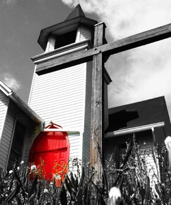
The Blood of Christ

Joined
Apr 20, 2013
Messages
265
Reaction score
80
Location
Philly
Can others edit my Photos
Photos OK to edit
I'm not a religious person by any means but I thought this was a decent shot. Let me know what you think!

$Church BW.webp
 
Your selective color is bleeding into other areas, flowers cross etc.
 
Composition clashes hard for me. Selective coloring doesn't seem to help that either.
 
Personally I would forgo the selective color and just make it a standard b&w image. I like the angle and composition.
 
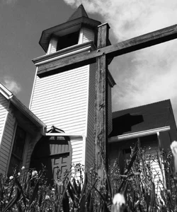
Something like this better? I'm not having any luck getting the shadow off the door.

$Church BW.webp
 
I like it like that, b&w only.
 
^agreed. It brings attention to the cross, which makes it a stronger religious image on top of making it a stronger image in general bc the subject is more defined.
 
I like the perspective, but would like to see the right side end of the cross in frame.
 
I like the perspective, but would like to see the right side end of the cross in frame.

Thanks for the feedback! Yeah, I wasn't looking through the viewfinder as the camera was on the ground. I took several and unfortunately this was the best one.
 
I didn't even notice the large cross, I was looking at the cross on the door - which the shadow on the door actually promotes.
 
I thought the selective coloring was supposed to be bleeding around.

The blood of christ WOULD be on the cross, after all, and also be a doorway. I kind of liked the allegory. A bit heavy-handed, but Christ allegories usually are.

I would move the camera a little bit to separate the cross from the architectural stuff around the steeple. It's nicely lining up with some things up there on the top of the church, but it's too close to them and it's a bit visually confusing, AND it de-emphasizes the cross. I think a slightly higher camer position, slightly to your left, just to visually drop the cross in the frame (just a little) would help. Obviously the point is that the cross is looming over the viewer, so there's a bit of a balancing act here.

 
The black and white is way better, but now the name doesn't make sense. lol
 
I didn't even notice the large cross, I was looking at the cross on the door - which the shadow on the door actually promotes.

Hmmm, I didn't even think of that. Shows how observant I am :lol:

I thought the selective coloring was supposed to be bleeding around.

The blood of christ WOULD be on the cross, after all, and also be a doorway. I kind of liked the allegory. A bit heavy-handed, but Christ allegories usually are.

I would move the camera a little bit to separate the cross from the architectural stuff around the steeple. It's nicely lining up with some things up there on the top of the church, but it's too close to them and it's a bit visually confusing, AND it de-emphasizes the cross. I think a slightly higher camer position, slightly to your left, just to visually drop the cross in the frame (just a little) would help. Obviously the point is that the cross is looming over the viewer, so there's a bit of a balancing act here.

Damnit, I wish I would have thought of that before you said it, then I would have had an explanation for screwing up the coloring lol. Thank you very much for the input, I'll probably head back there and take a few more today since it's right down the street.

The black and white is way better, but now the name doesn't make sense. lol

Haha very true. I personally like the selective coloring (when I can do it right) but it seems a lot of people don't. Too distracting from the rest of the image I take it?
 

Create an account or login to comment

You must be a member in order to leave a comment

Create account

Create an account on our community. It's easy!

Log in

Already have an account? Log in here.

New Topics

Back
Top Bottom