
friz1983
TPF Noob!
- Joined
- Aug 6, 2014
- Messages
- 52
- Reaction score
- 55
- Location
- Utrecht (NL)
- Can others edit my Photos
- Photos OK to edit
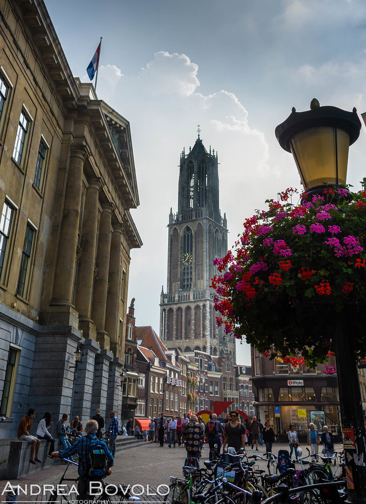 Domtoren by andrea.bovolo, on Flickr
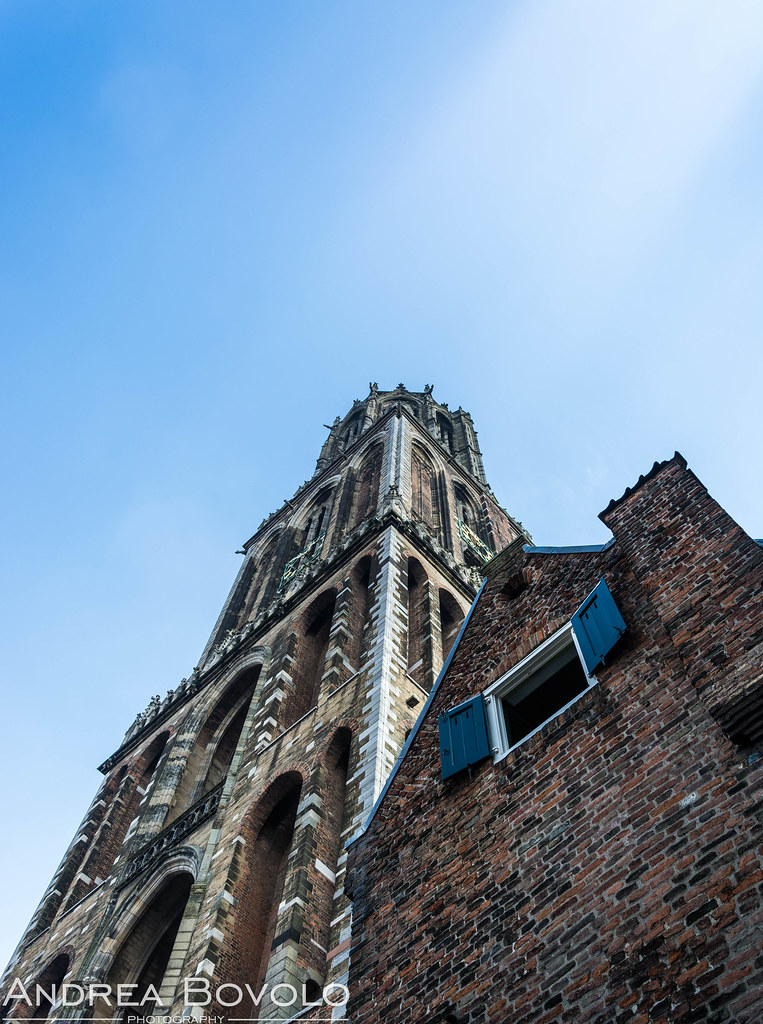 Domtoren by andrea.bovolo, on Flickr
the tallest church tower in the netherlands
![[No title]](/data/xfmg/thumbnail/32/32175-dfc7c053c145a53c7f2585ca44f122d4.jpg?1619735235)

![[No title]](/data/xfmg/thumbnail/32/32176-48b4ba2fc0e35afa267c5882154e7620.jpg?1619735235)

![[No title]](/data/xfmg/thumbnail/35/35952-55c8d42ec1c6ff0e13b45356cbf9c068.jpg?1619737263)