Old edit vs new edit

CherylL

TPF Supporters
Supporting Member
Joined
Aug 6, 2012
Messages
4,829
Reaction score
5,763
Location
near St Louis
Can others edit my Photos
Photos OK to edit
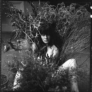
This photo is from 2020. After watching a bunch of YT videos, I did a re-edit for practice. C&C welcome.

Old Edit
042120_035SMweb.jpg


New Edit

Quincy back lit by Cheryl, on Flickr
 
Definitely warmer edit on #2, and since he's sitting in front of a sunny background it looks better. You removed a lot of blue, it looks like.

His fur is overall warmer too, as cgw noted, but still reads gray - just a warm gray. Not bothering me a bit. His eyes seem clearer and brighter, too.

I think you did well here! Nice job.
 
I refer #2 s well. I like the warmer tones.
 
Since you asked for C&C not likes and I'm somewhat familiar with your skill level, here's my take. I will go back every so often and rework an image. To me, editing is a process of improving the positive attributes of an image, and decreasing the negative. I try to let the image itself guide me in those decisions. It's a combination of technical skill, and personal taste, which changes over time. Sometimes I see improvement and sometimes i find that there's a point you have to just leave it alone.

In the case of Quincy there's a noticeable shift in WB, between the first and second. I've noticed over the years that people "perceive" WB differently, and over time those perceptions change. WB affects how we perceive all the colors in the image. Rather than rely on my eye after the fact, I always use a target. I prefer the warmer second image, but for the reasons noted above have no way of knowing if the colors of his coat are accurate.

In addition to WB, setting the correct White point and Black point is just as important, in color management. In your rework the histogram shows the White point and Black point are limited. A decrease in either will affect the vibrancy of the colors in an image, and the micro contrast transitions. I realise this might have been a creative choice, as I occasionally choke them to take the edge off off an overly sharp image.

There is some noticeable shadow recovery in Quincy between the first and second, and significant sharpening/brightening in the eyes. Definitely an improvement. IMO, his fur needs dodging and burning, to bring out the detail.

If I were to rework the image I'd look at the background. While cool colors normally retreat, the neutral colors of his coat aren't forcing the greens back. You also have the same issue with the road surface. Good place to pull multiple gradient filters to make him the star.
 
Thanks for all of the replies! Much appreciated.

The first image has a purple tone and edited 2nd image to reflect his natural coat color. He had on a green harness, which I took out, and it may have cast a slight green tone to his fur.

I added a gradient map slight blue to warm gold. I think the shadow in his coat may have too much of the blue.

The fur had texture added in ACR and some dodge/burn in PS. Good to know that it isn't overdone and I could add more to his coat.

In the case of Quincy there's a noticeable shift in WB, between the first and second. I've noticed over the years that people "perceive" WB differently, and over time those perceptions change.
Agree this is 100% true. Some of my older images of the grands were too pink. At the time I thought they were ok, but since then looking at 1,000s of images from others and watching tuts I can now "see" the WB. It may not be 20/20 vision :) Good point on using a reference photo.

Thanks again for everyone's input!
 
The fur had texture added in ACR and some dodge/burn in PS. Good to know that it isn't overdone and I could add more to his coat.

It's important to understand the difference in how Texture and Clarity work in choosing the correct tool. Texture works to increase the contrast of high frequency pixels, but avoids sharpening the edges. In fine hair I haven't found it that effective. Clarity on the other hand is a more broad brush which will affect the edges. To much Clarity though and you run the risk of halos.

Tonal transitions are the global shift in values that will be affected by tools like Texture and Clarity. Micro Transitions are the same shift, but on a much smaller scale. It's possible to use frequency seperations to drill down on these areas, but in the end I always found the more tedious dodge and burn with a brush method better.
 
His fur is overall warmer too, as cgw noted, but still reads gray - just a warm gray. Not bothering me a bit. His eyes seem clearer and brighter, too.
Looking at his fur again, I now see that it is grayish. I warmed it up and added more dodge & burn to the fur.

042120_035 copy2SMw.jpg
 
Hi the second image for me. As Smoke has said the web is different. For me I ’see” the first image as having a magenta /purple colour cast to it.
 
It is sometimes quite interesting to look at old images, to see how skill levels have changed and what you are photographing.
the was a interesting chat at my local club about this subject
 

Most reactions

New Topics

Back
Top