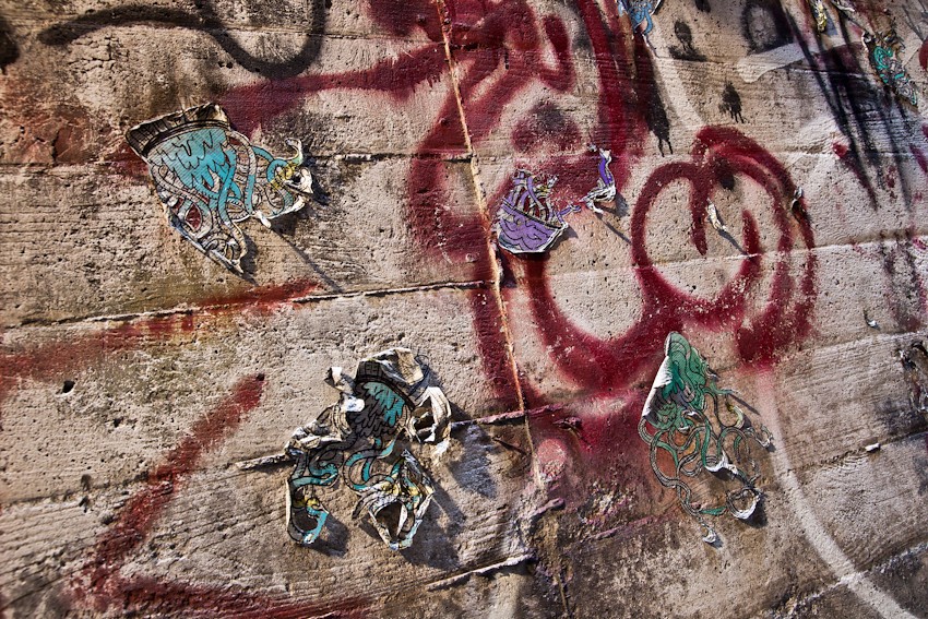
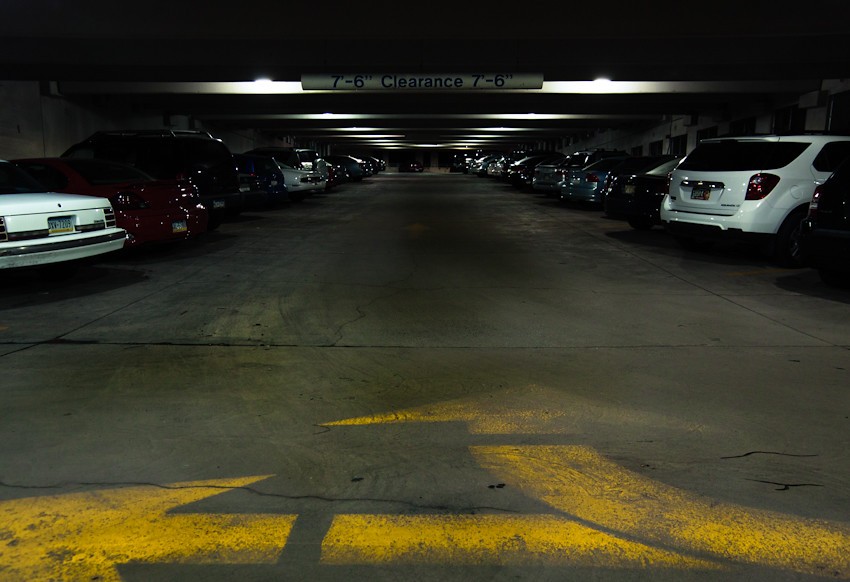
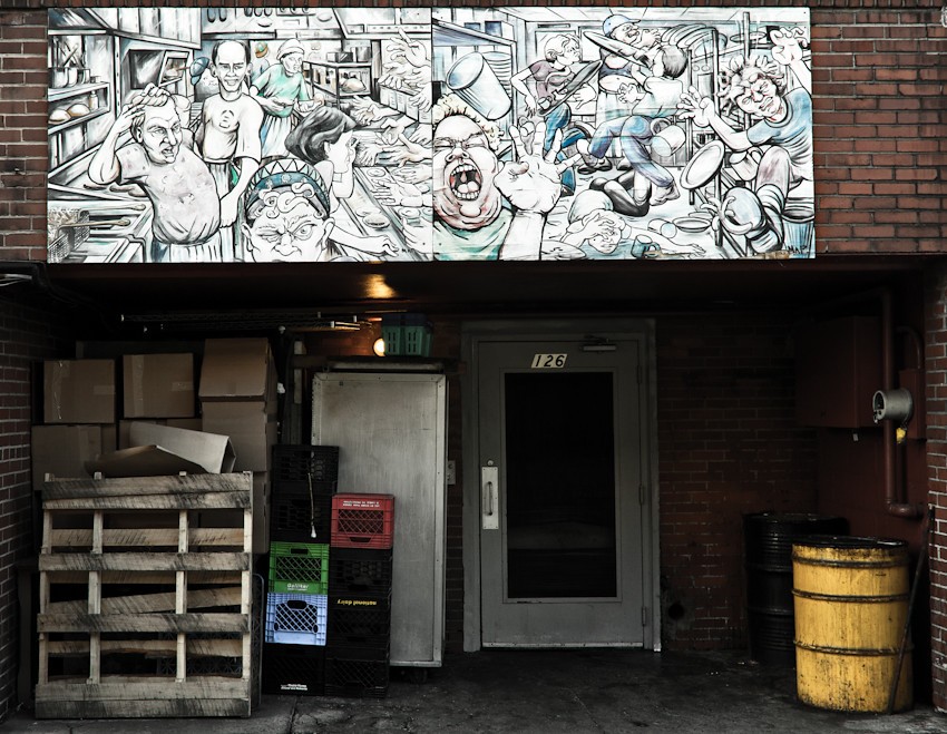
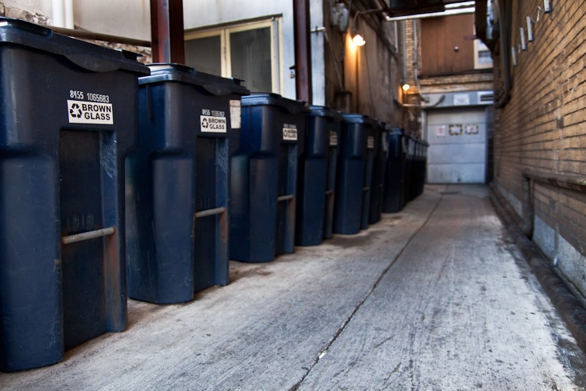
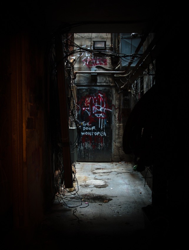
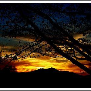
Love #8! #2 is a very interesting study in light, texture and pattern. #4 would be better as a panoramic with the mural cropped out. I don't think the mural does anything to contrast with or explain the bottom part of the image. #3 is interesting too, but I would have gotten down lower and made the arrows a bigger part of the image.


")
![[No title]](/data/xfmg/thumbnail/35/35929-8650428697cfb142a7b9a4e8ef731178.jpg?1619737232)


![[No title]](/data/xfmg/thumbnail/37/37631-1af996afcca522b3c5490538125d9599.jpg?1619738155)

![[No title]](/data/xfmg/thumbnail/35/35931-5e10675f3f7d827bc7ae4689f16bda8a.jpg?1619737234)

![[No title]](/data/xfmg/thumbnail/31/31086-ae0d6678ca78859132ce5375d5300961.jpg?1619734602)