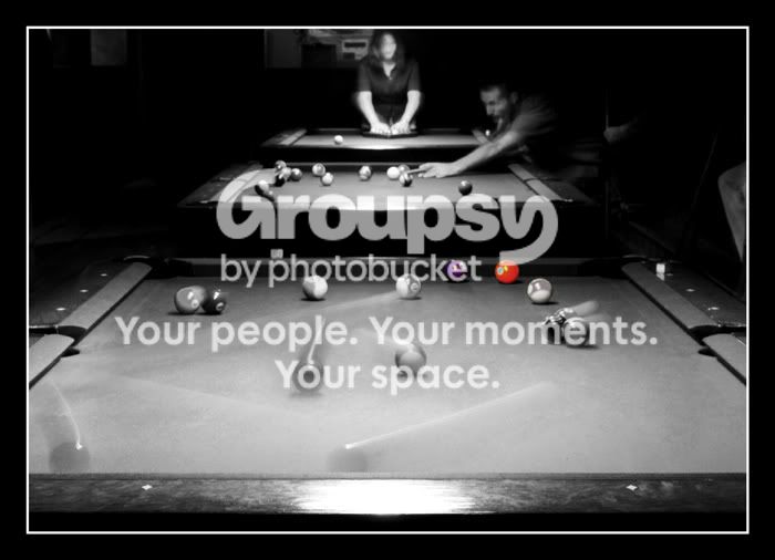
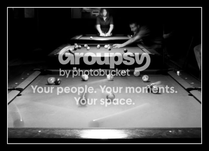
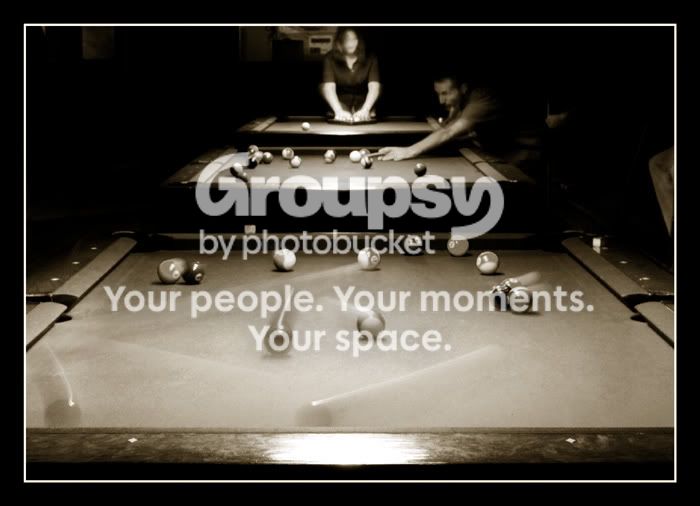
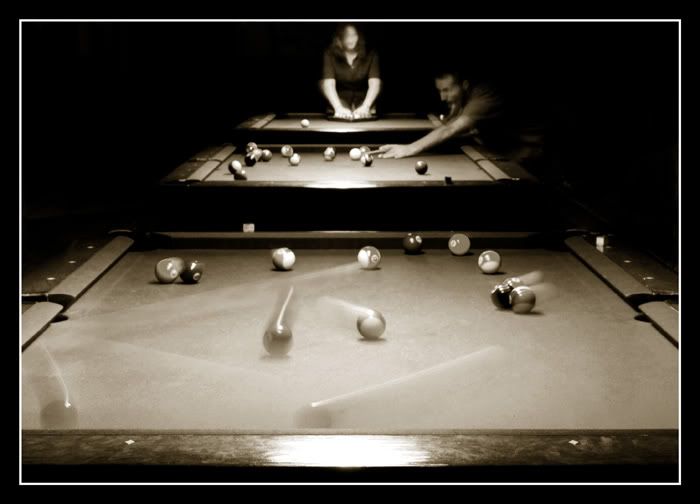
I always enjoy your billiard shots...but in this particular case, I don't care for the selective coloring. I did in the past shots. But for this one, I think the color is too far away from the subjects in the bg and takes away from them. I think they lend a hand to the photo. It's almost they're playing on all three tables at the same time...and that's cool!
As always, I appreciate your comments Mr. wood! I like the selective coloring version because, to me anyway, each colored ball represents and is pretty well in line (visually in the image) with each of the background players. 'Loneliness, together'. I also agree though that it takes focus away. I tried several versions of this shot, so I will include two more for your ponderance.
The last addition adds a really classy touch this shot! Nice.
And don't make any changes if you like it! You know what I mean? If you had a vision when you shot and edited, and it turned out the way you wanted it, then keep it
Thanks.
I always have trouble deciding which version of a particular shot to keep/print/submit/etc......You should see me in the darkroom, it's rediculous.
So all outside input is extremely helpful to me. Thank you!
Rock on completely................
I agree with Woodsac, I liked the selective coloring in the previous posts but its distracting in this shot. I prefer the sepiaish (new word) version, I really like this shot daddio, probly the most out of your billiards series, nice work!
I hope it's okay to post this many revisions in one thread. I removed the BG distractions, I didn't like that thing growing out of her head. I think I'll keep this one!







![[No title]](/data/xfmg/thumbnail/39/39185-29433e4f46e4b0bd394d10962886594c.jpg?1734173059)
![[No title]](/data/xfmg/thumbnail/42/42269-bc38cb35884d46241dcf3623b338b43b.jpg?1734176665)
![[No title]](/data/xfmg/thumbnail/32/32708-c55da623febe9d91efe5f28aa54c3090.jpg?1734162300)



![[No title]](/data/xfmg/thumbnail/31/31013-b871f1d295c83b831c1423028e1ce5dc.jpg?1734159090)