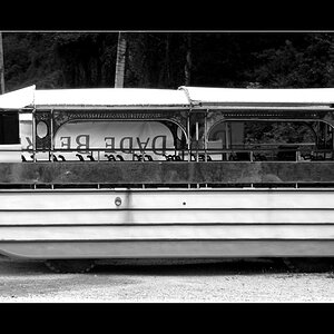
The lonesome house panoramic, I need some help

bantor

TPF Noob!
Joined
Aug 15, 2005
Messages
526
Reaction score
9
Location
Calgary Alberta
Website
jrcreations.bravehost.com
As my family and i were driving along we saw this old house sitting on a hill, and my step dad mentioned how he liked it, due to how random it was just sitting there all alone. So I drove back out there and took a few pictures. I intend on enlarging this to be about 2 feet 6 inches long (152cm), and like 5 inches (12.7cm) high.

So i took three shots, and put them together for this panoramic, there is a fair amount of post processing involved in this one, but nothing that changes the actual look, i just did enough to make it look as seemless as i could.

So I was wondering what you all thought about it so far, its still kind of a work in progress so here it is:

before sepia:


after sepia:
 
Great find. I love just driving around and spotting all the old, forgotten places in Alberta as I listen to Woody Guthrie's Dust Bowl Ballads (Just kidding.... that is, about Woody Guthrie, even though I will admit I have his CD :blushing: )

The composition and everything is great, especially the 'leading line' in the field to the barn/house. I just which there was more 'drama' in the sky, especially to the right of the photo. Any way you can boost the contrast in the sky perhaps?
 
I know what you mean, i found all kinds of really cool stuff the day i went out, there are so many old places to find, specially in the praries.

I agree with about the "drama" in the sky, I really wish there was more, I would love to get another shot on a sunny, but slightly cloudy day, but stupid snow is coming soon and i also wanted there to be no snow. The day i shot that one was a overcast/rainy day.

I tried all kinds of different things, and i can't get any more contrast between the clouds and the...clouds, I was thinking that I could try to edit in some clouds, but that would take away from its originlity a bit, but i will give it a shot anyways i think
 
Actually, I was thinking that there is just about enough "rolling waves" in the clouds to the big expanse on the right of the picture to make it interesting, well, I thought so when I saw the "after sepia" version, which appeals to me more because it seems to enhance the loneliness of the house and its dilapidated state. Well, now don't ask me why I think that "dilapidated" and "sepia" go together ... it may be because sepia coloured photos give you the impression of "old" or at least "older" (?).
 
Alright, I have done a bit of messing around with the sky, but i am not sure if i like it.

The reason I am so intent on getting this picture so perfect is because it is to be a christmas present you see, so the help means alot.

Here is the update:


Note: there will still be cropping and resizing and what not to come.
 
This one is better, but I think this shot would be better in color. I can post an edited version if you like?
 
Just a few adjustments...curves, contrast, saturation

24ni.jpg
 
bantor said:
wow, that looks good, you know i have never tried playing with curves, never been to sure what they are for, but you have inspired me.
Curves are your friend :mrgreen: If you're using CS2, also take the time to get familiar with shadows/highlights. Very powerful. Not just for dark pictures. I used it to help bring out the colors of the field before I did some of the other adjustments.
 
Hm, i have been messing around alot with contrast, saturations, curves and shadows/highlights, and i really like the look of the field and sky in color, but for some reason i still like the sepia house better, a difficult desicion.
 

Most reactions

New Topics

Back
Top