What's new

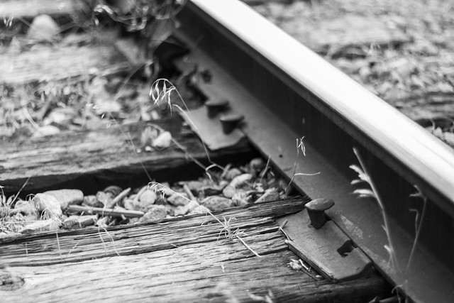
The Missing Spike - cc welcome

Not very constructive. But I like it.
 
Ryan, to be honest it is not something I would print. This picture lacks "punch". Weak composition, missing spike is not in any of the strong points if the picture, very shallow and strangely formed DoF. Rail is reflecting so much light it is white and cuts the frame in parts without any proportion. Also takes too much attention. The same with the very sharp grass in the unsharp zone to the left and above the "missing spike". What lens did you used ? Maybe it's only me, but I don't like the bokeh of this glass. Was that the only picture you took of that subject ? Maybe it requires a bit more of work, some subjects are not easy. I would clean the area from the unwanted objects like grass and debris like sticks, make the immediate area more synthetic. Maybe different angle to, maybe much lower and maybe almost vertical, but in any case I would try to place the main subject rather in the center. Sorry, if that is too much, but I imagine myself shooting this. What do you think ?
 
Thank your for the feedback timor, i love your input! This is shot with a Canon 50mm 1.8. However, I have never thought to prepare a scene before, thanks for opening up my eyes to that.
 
Shooting such a small, flat and position so low subject like yours is not easy, sometimes control over the environment is needed as small thing may become a big distractions. Good luck.
 
Here's a thought or two.

You saw something that caught your eye, and you photographed it. Good. But the viewers of your image don't have the benefit of what you saw before you took the image, we can only see what you included in the image. And what you included in the image doesn't fully convey what you saw. So let's back up a bit.

For something to be missing, is has to be seen to be missing, ie, a pattern is established and the missing component is obvious. In this case, we see clearly the missing spike, but we see only one other plate. To create a pattern, you would need at least one other plate to be visible to show that this is an exception. Figuring out how much to include to create that pattern is something that you have to do by trying different framings and see which one works best. The height, closeness or distance to the subject, etc. are part of the compositional framing. In general, diagonals work better than horizontal (or vertical) straight lines.

Once you have your prime subject, you also have to determine how much contribution the foreground and background should make to the image. In general, it should contribute to the main subject and not compete with it. So the choice of what to include, what to exclude, how much sharpness or blur to use, all become part of the artistic decision to direct acttention to your prime subject. In this context, that partly out-of-focus blade of grass near the missing spike is clearly a distraction.

Then there is the matter of exposure - it's ok to have blown highlights if there is no detail in the highlights that needs to be seen, but it also creates blocks of brightness that will pull the viewer's eyes, and perhaps make them miss the main subject. So part of the trick of presenting the image is to make the main subject sufficiently well defined that the eye goes there first (we tend to look at sharply defined stuff before we look at bright blobs). Definition can also be improved by lighting - but this is easier to do in a studio setting than in the field.

In summary, you saw something that caught your eye, and you had an idea of how to covey what you saw to other viewers. Timor has given you some good advice. The challenge is to learn to slow down and to analyze a scene to see what elements work, which need to be emphasized, and which should be eliminated. At least in my own case, putting the camera on a tripod forces me to examine the scene more thoroughly, and verify whether I got the framing, DOF, and exposure right. It also allows me to check the margins/edges of the image and see whether the background/foreground is creating distracting elements. And usually, I take a number of shots, in various orientations, and from different perspectives, because I have seen too often something at home that I didn't see in the field.

Finally, the advice that Lew Lorton has given in another thread applies here - I have it as part of my signature. Three sentences, but a lifetime of photographic experience distilled.

 
Last edited:
I agree with many of the previous comments, although having the missing spike near the corner is not really a weak position in the composition. All this boils down to two important things: (1) get closer to what you want people to look at so it's larger in the frame, and (2) use a smaller aperture so you don't have distracting out-of-focus elements near the subject. Oh, and to do (2) you probably want to use a tripod or some kind of support - usually you can't do close-up narrow aperture shots without it.
 
I think the composition here is fine. It's unorthodox, but it works. The position of the important element is a little far from the center, but is well placed (see, e.g. Tomoko Uemura in Her Bath, which has a similar placement of the important things). The shallow DoF and unusually forward plane of focus brings the eye to the important element, after a moment. There are lines to help you out here, as well.

This is an image about the missing spike, sure, but the fact that it's missing is intended to be a subtle point, one that we have to work at a little to see.

I think the frame is a little busy, and the out of focus material in the top third is downright ugly. This is not a lens that treats out of focus detail in a pleasing fashion, unfortunately.

If this were mine, I would probably:

- try to recover some detail in the top of the rail, as has been noted this is blown out
- lighten the lower right corner a bit, the "important point" of the image is not helped by the adjacent shadow here
- darken down the rest of the image, especially to try to de-emphasize the out of focus stuff in the upper third
- add a very slight vignette, not noticable, to "close up" the frame a bit
 
All the advice above is valid and well thought out. When I first looked at the photo it just didn't work for me but it took me a few moments to figure out exactly why. I think the analysis of pgriz is hittiing it pretty close. One of the hardest things for a photographer to do is to make a viewer see or feel what he saw or felt when he took the photo. Context is important in achieving that. So.. you spotted a missing spike and it made an impression on you in some fashion. Without context it doesn't come across to the viewer (or at least to this viewer) It doesn't have an element that draws me in to it. without the title I would not have known what you were trying to show me. But even with the title I'm left wondering why it should be worthy of attention. Yes, there are a few technical flaws that could have been corrected but the main flaw as I see it is that it's not an interesting composition to start with. Other views of the same scene might have been more pleasing or interesting. Hard to say since we can't see the rest of the scene.
I do give you full credit for keeping your eyes open for photo possibilities. sometimes we win, sometimes we lose, and sometimes the games called on account of rain. Keep shooting and keep in mind the advice of the others who have offered suggestions. It's all a learning process.
 

Create an account or login to comment

You must be a member in order to leave a comment

Create account

Create an account on our community. It's easy!

Log in

Already have an account? Log in here.

Back
Top Bottom