What's new

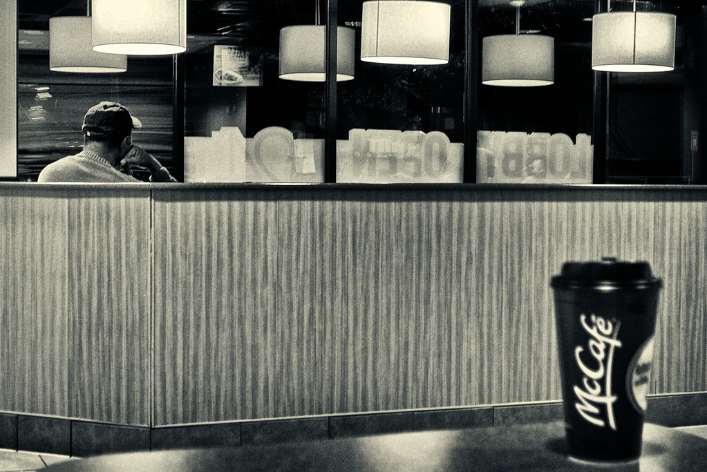
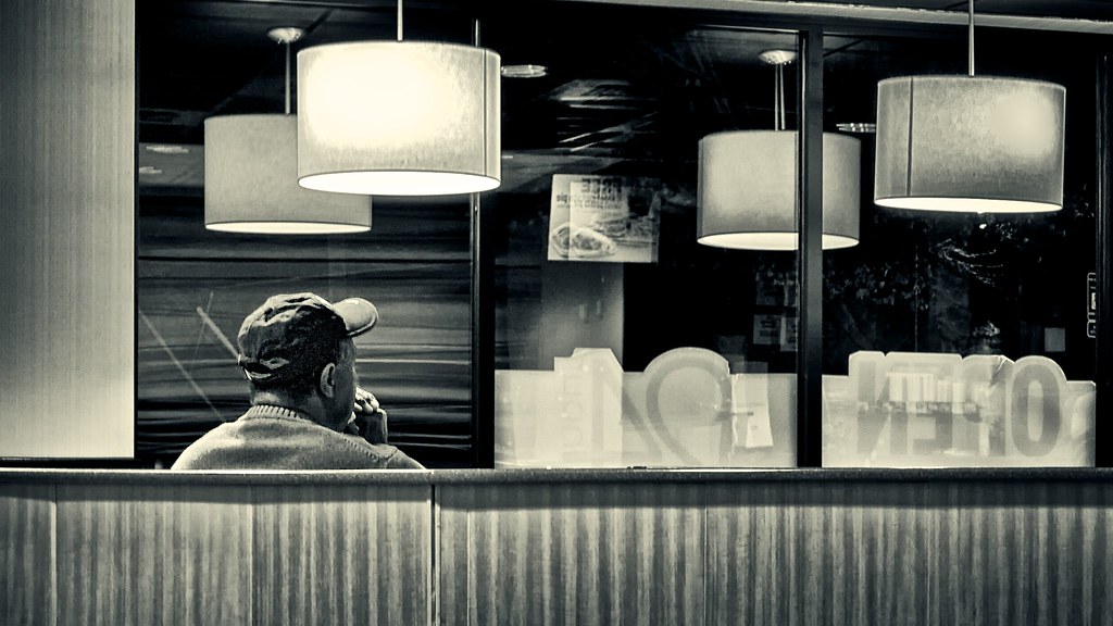
The Modern American Cafe

I like it!

For the sake of CC only, I may have removed the swordblades sticking into the dude's shoulder =)
 
For the sake of purity, this was shot, edited and posted all while in said McDonald's.
 
Last edited:
Like it!

Try the removal suggestion. If not still good!
 
yeah, I guess those lines weren't as noticeable in the original color version and then they were brought out in the BW conversion.

Thanks guys!
 
Removing the lines didn't help it much, and may in fact have hurt. If you wanna shoot street and then clone out stuff, then why not just buy a print of this?

nighthawks.jpg
 
Removing the lines didn't help it much, and may in fact have hurt. If you wanna shoot street and then clone out stuff, then why not just buy a print of this?

nighthawks.jpg

I didn't really consider it street, hence why I put it here as opposed to the people gallery. To me street is more about capturing people, a moment and human emotion. While there is a person in it, it's not really the point, or at least I didn't think. The point was more of the place and the everydayness of it. It's certainly not journalistic in nature, I don't think. There's way too much contrast and dodging and burning to really be considered journalist street style.

Edit: just clicked on your link and sort of a 'modern americanized' version of a rockwell painting was exactly what I was thinking when I captured it. ie an unglamorized version of that exact painting for our current condition was exactly my thought, but shot from the inside instead of the outside.

edit: oops, obviously hopper, not rockwell
 
Last edited:
I think this is terrific.
The guy is in the right spot, looking out into what seems busy but is really nothing.
That damn cup is cropped out - which ruined the original
The detail is diminished so you have essentially a cartoon but we know it is real.

I would suggest three things to try.
Crop it to 4 x 6 because there isn't enough content to support the pano look and that crop cuts off the word OPEN which adds to the effect and tightens things up.
Burn the corners to remove or cut down on the bright area in upper right.
Maybe even a sepia tone.

$8233424139_13b191afdd_blll.webp
 
Thanks Lew.

Yeah, I definitely felt that the was the stronger of the two shots. The original was mostly posted for thoughts on why it fell a bit flat. Part of me thinks I could have gotten the cup to work in some way, but it probably only would work in the deep recesses of my own head.

As processed originally it had a very mild two tone sepia/cyan toning and very mild burning of the edges. I always tend to try to go more subtle.

The 'cartoony' effect is just from shooting a point and shoot camera in a mcdonalds at night on high ISO at a slower shutter speed than I should really be able to get away with and then cropping it in even further, haha.
 
I'm not so sure that the cup "ruined the original"...in fact, from a historical perspective, that McCafe cup actually places the image into its "modern-day" time frame. Is that a good thing? Or a bad thing? The cup places the photo in the latter half of the first decade of the 21st century...the "McCafe" concept is Mickey D's new marketing campaign to try and siphon dollars and sales awat from Starbucks and allllllll the other coffee shops that have sprung up. With the McCafe cup included we KNOW where this image was shot at, and we can mentally refer to an entire subtext of McDonald's memories, thoughts, stereotypes,impressions, and knowledge; with the identifying cup eliminated, the photo becomes more universal, and less-associated with a specific type of restaurant. Good thing? Bad thing?

I think of this as street, and so to me, the cup HELPS the shot, and is in fact, a very strong, integral part of the original photo. With the cup eliminated, the photo changes markedly. With the word OPEN cropped down to "PEN", and the word LOBBY entirely eliminated, the photo changes again. The original shot, with the man resting his hand on his cheek gives one kind of a feeling...the second photo with his hands clasped in front of his face is another "feeling" entirely.

This is an excellent scene for a study in how compositions can be altered by the process of elimination.

 
I like it sans cup. The font really contrasted with reast of the image.
 
I think the cup is totally necessary.

It balances the guy, and it changes the image from a ripoff of nighthawks into social commentary that references nighthawks. It makes it very good. The cup also echoes the shapes of the lights, helping tie the whole thing together graphically, and easing the nighthawks reference to a reference alone, instead of a copy.

Leave the lines alone, leave the cup alone. Your first instincts were right, I think.
 

Create an account or login to comment

You must be a member in order to leave a comment

Create account

Create an account on our community. It's easy!

Log in

Already have an account? Log in here.

New Topics

Back
Top Bottom