What's new

The Old Pumphouse

Civchic

No longer a newbie, moving up!
Joined
Nov 5, 2013
Messages
637
Reaction score
334
Location
Hamilton, Ontario, Canada
Can others edit my Photos
Photos OK to edit
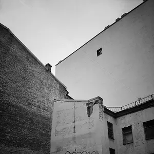
The Hamilton Old Pumphouse was originally constructed in 1856-1859 to house the two big (BIG) pumps that drew water from Lake Ontario up to the Barton reservoir on top of the Niagara Escarpment, where it was then distributed by gravity to watermains throughout the new city. It last pumped water in 1938. In 1971 the Pump House and adjacent buildings were renovated, and the pumps refurbished to working order to serve as a museum. Nowadays the boilers no longer operate - the pumps are run for demonstration purposes with an electric motor (that whole 150+ year old boiler exploding thing), but it is still an impressive sight to behold those big flywheels turning. The entire site was designated a Cultural Heritage site in 1997.

Yesterday the kids and I toured the museum (oh, they also have a fully operational miniature model railway that you can ride on, it's very cool, with tracks running around the entire property, including a mini trestle bridge). My boy loves big machines!


june 22 011 old pumphouse bw by civgirlca, on Flickr

C&C welcome - I converted it to B&W and pulled up the red and green a bit to gain some contrast - the original colour version was sort of boring. I'm not too happy about how the roof and the sky are so similarly bright, but at least the roof line is a solid marker.
 
Hey, thanks! The machinery geek in me would like to see the works inside.

BTW; it needs straightening (CW 0.6 degrees).
 
The tree has a different tone from the rest of the photo.

Why adjust greens and reds when editing monochrome? What about brightness/contrast or fiddling with shadows/midtones/highlights? Curves? Forgive me if the questions sound rude, but they really are borne of curiosity. I don't often do a lot of post processing, so I'm not familiar with a lot of techniques. And when I edit monochrome images, they usually started out that way (black and white negatives) so perhaps it's different to edit a RAW (I assume?) image that has been converted. My one digital camera only shoots JPEG, and I edit those the same way I would a scanned negative.

This might benefit from a border. The sidewalk at the bottom of the frame is pretty blown out and it looks like the shadow of the building and the little girl are actually outside the frame.
 
I'm a machinery geek as well, but I took REALLY CRAPPY pictures inside. I'll have to go back without needing to make sure a 2 year keeps her fingers out of cylinder grease and doesn't climb on 150-year-old wood guard rails. LOL. The original pumps were run by cast iron walking beam engines (6' stroke powered by 4 wood-fired boilers), with carved cast iron pillar conecting rods to the pumps. It's very ornate and impressive. The flywheels are 22-ton 24' diameter cast iron wheels.

And I will straighten it up. I think I have crooked eyes. LOL.
 
The tree has a different tone from the rest of the photo.

Why adjust greens and reds when editing monochrome? What about brightness/contrast or fiddling with shadows/midtones/highlights? Curves? Forgive me if the questions sound rude, but they really are borne of curiosity. I don't often do a lot of post processing, so I'm not familiar with a lot of techniques. And when I edit monochrome images, they usually started out that way (black and white negatives) so perhaps it's different to edit a RAW (I assume?) image that has been converted. My one digital camera only shoots JPEG, and I edit those the same way I would a scanned negative.

This might benefit from a border. The sidewalk at the bottom of the frame is pretty blown out and it looks like the shadow of the building and the little girl are actually outside the frame.

Not rude at all! I can't even really answer it - I'm just starting to do post processing myself and I follow the totally technical school of "fiddle with sliders and see what happens" teaching. I'm still using Canon's photo professional software while I slowly trudge through the GIMP software tutorials, and I liked what this did. :) I'm an experiential learner - play with things, see how they work, then later learn WHY they work.

I'll try the border as well, that's a good idea.
 
Normally I'd be having my normal "blown highlights" temper-tantrum, but for some reason, I'm REALLY liking the way you have the blown foreground with the child on it and then darker building and blown roof/sky. NO idea why, but this is working for me. :confused:
 
The tree has a different tone from the rest of the photo.

Why adjust greens and reds when editing monochrome? What about brightness/contrast or fiddling with shadows/midtones/highlights? Curves? Forgive me if the questions sound rude, but they really are borne of curiosity. I don't often do a lot of post processing, so I'm not familiar with a lot of techniques. And when I edit monochrome images, they usually started out that way (black and white negatives) so perhaps it's different to edit a RAW (I assume?) image that has been converted. My one digital camera only shoots JPEG, and I edit those the same way I would a scanned negative.

This might benefit from a border. The sidewalk at the bottom of the frame is pretty blown out and it looks like the shadow of the building and the little girl are actually outside the frame.

Not rude at all! I can't even really answer it - I'm just starting to do post processing myself and I follow the totally technical school of "fiddle with sliders and see what happens" teaching. I'm still using Canon's photo professional software while I slowly trudge through the GIMP software tutorials, and I liked what this did. :) I'm an experiential learner - play with things, see how they work, then later learn WHY they work.

I'll try the border as well, that's a good idea.

I'm kinda with you on the "Hey, what does this do?" school of teaching :)

I do like the slightly warmer tone of most of the photo, and just wish the tree matched it more closely. I like a high contrast look, so the blown areas don't bother me because they're well balanced in this image.
 
You're right - the tree does seem cooler in tone, even though I edited the image as one block. It's a poplar, so the green of the leaves is obviously a lot bluer than the grass and the limestone. I'll have to try working on a specific area of a photo with this one! Ha. I think it's worth it, I really like the way this one is turning out.

Tirediron, I know what you mean - it is really blown out, but...my eye likes it.
 
I like the blown out foreground just because it amuses me. I would take the building shadow out so it looks like your daughter is out of the picture running in with a caption, "hey wait for me I'm not in the picture yet" :)

I like the photo and there is a lot you can do with it.
 
I like the angularity you have shown, but I can't get past so much of the frame is lost.
 

Create an account or login to comment

You must be a member in order to leave a comment

Create account

Create an account on our community. It's easy!

Log in

Already have an account? Log in here.

New Topics

Back
Top Bottom