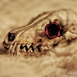
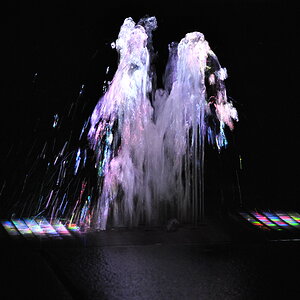
Your second image is interesting enough; the colours are clean and vibrant enough to, when mixed with the composition, hold attention.
However, it's still not quite as effective as is. A darker exposure with a silhouette would have worked - to give a simple dark cast. It could also have more form and be a little smaller and to the left in the frame.
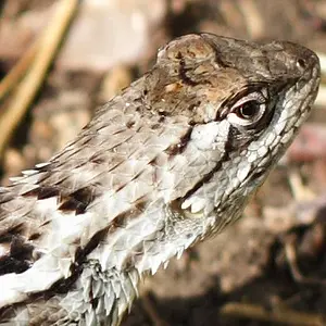
With the second (EDIT: Last, sorry) one; if you can retain the colours of the previous one, it would have been excellent. It could do with a little more contrast... looks rather hazy (the entire photo).
But otherwise, they're well captured.
A :thumbup: from me.












![[No title]](/data/xfmg/thumbnail/31/31979-ea92aca54ae865842d998c9cec534991.jpg?1734160756)