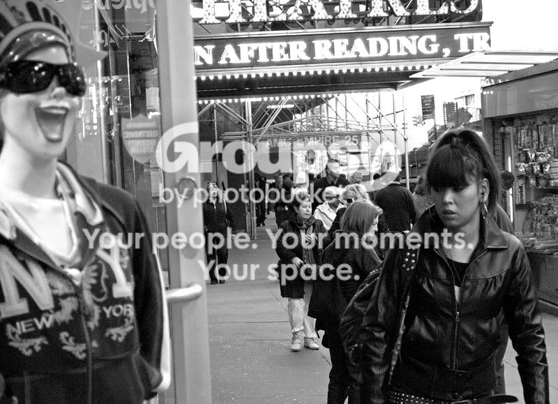
1) The fundamental problem here is that the eye is first drawn to the bust in the window, since it's relatively bright, and then to the woman window shopping, who is the subject. We want to draw attention to the subject first, and then to the commentary on the subject (the bust, which makes commentary on the woman, who represents American consumerism) - and yet, we want to keep the tones the way they are - keep the bust bright to comment on the glitzy nature of fashion, and the woman dark to comment on the current financial crisis. I'd probably: a) recompose to put the woman in front of the bust rather than to the side in order to help make sure that the eyes get closer to here, b) throw the aperture open a little wider to get rid of the people cluttering the background, and c) maybe use a circular polarizer to get rid of the reflections in the window, the white-level of the bust is enough to get the point across without what is essentially as bright as having a sun in the photo, let alone a sun on top one of the photo's emphases.
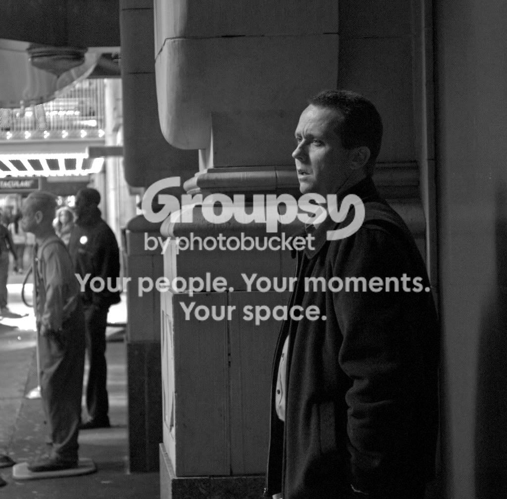
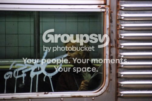
2) Shallower depth of field would do this wonders - eliminate distractions and add to the loneliness feeling here. Watch this, you can simulate a shallower depth of field in photoshop: [ame]http://ca.youtube.com/watch?v=DA8TgyTruV8&feature=related[/ame]
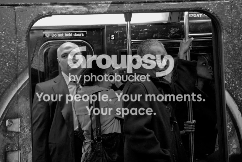
3) Crop off the top and bottom, make the photo look like the taxi is in a sleek kind of motion.
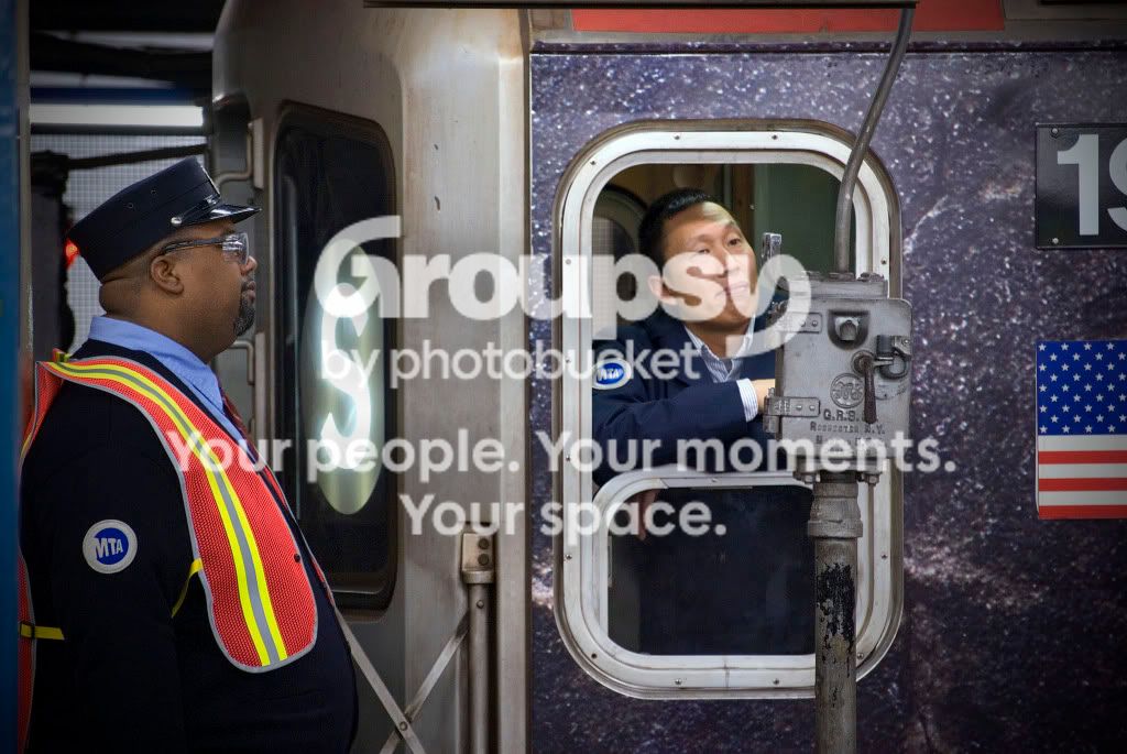
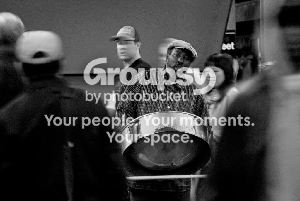
4) I like this one, interesting commentary on the American "melting pot" further enhanced by the texture that the wrap-around advertisement brings.
edit: 10 minutes in photoshop for #2 using the tut linked to on youtube:









![[No title]](/data/xfmg/thumbnail/33/33489-cc76e5d22658c0f79ccb4ae9d307610d.jpg?1734163602)
![[No title]](/data/xfmg/thumbnail/41/41764-1385c153e9fea917b7efea0bbde7eefe.jpg?1734176069)



![[No title]](/data/xfmg/thumbnail/38/38723-12789924db409b40399a402700ac823c.jpg?1734172598)

![[No title]](/data/xfmg/thumbnail/34/34083-76406a409bc520ead3cc11af09ebd257.jpg?1734164516)