What's new

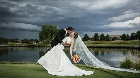
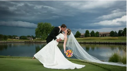
the perfect storm- one of my best pics

I find the dark, dreariness of the sky and surroundings at odds with supposed joy of getting married... YMMV!

I also find the image off balance with the subjects centered... and the veil way off to the edge of the frame leads the eye right out of the image... That tree intersecting with the groom is a bit distracting also...

Just a crop suggestion.. gets rid of some of the dreariness.. puts more emphasis on the subjects...

View attachment 50202

I did a quick Re-Edit.. to shorten the veil... so it doesn't lead the eye out of the frame. I think it balances better now....
Hey, how did you get the RAW file. I want to play too! Gimme the file.

no one has the raw file
 
thanks tail gunner i agree
pixmedic dont like the edit in full res i got plenty of detail in both tux and dress, obviously the detail isnt blown out otherwise you couldnt pull it back. i think the whiteness is a great contrast to the rest of the pic

i would have to see it full res then.
in the pic you posted, the dress is blown out. no details at all. the tux is so black, you cant even tell where his arm is.
with the shadows pushed a little, you can actually see that he has a collar, and an arm.
with the hightlights bought down, you can actually see that the entire dress is textured.
I just thought it looked better being able to see some detail in the tux and dress. no biggie.
the detail might be in the FILE, but it was not in the picture you posted.
the whiteness very may be a great contrast, but in the original picture you posted, the dress just looks like one big white satin mass. you cant tell that it has a pattern until you bring down the highlights. a lot. this is what we call "blown or clipped highlights".
if the full res picture shows detail, post a link to it so we can see the difference. maybe it was just a compression issue since the site only allows so large a file.

The idea behind posting to the galleries here is to get other peoples opinions.
and since you allow editing of your pictures....
you get to see what different people using different styles and different visions think the end product should look like.
I didnt say your photo was wrong, I only showed what I would have done with it. ;)
 
Last edited:
I would take it as a compliment that so many people want to have a go at editing it. Everyone seems to think it a great shot (apart from the veil :( ) and wants to spend their own time editing it!
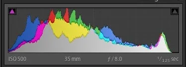
 
maybe you should check your monitor calibration
if the highlights were truely blown out then no one could be able to pull them back especially with the jpg posted
furthermore none of the whites are even clipped or close to being clipped and as for the blacks they look good on both my monitor and hostogram
i respectfully disagree
$histogram.webp


thanks tail gunner i agree
pixmedic dont like the edit in full res i got plenty of detail in both tux and dress, obviously the detail isnt blown out otherwise you couldnt pull it back. i think the whiteness is a great contrast to the rest of the pic

i would have to see it full res then.
in the pic you posted, the dress is blown out. no details at all. the tux is so black, you cant even tell where his arm is.
the detail might be in the FILE, but it was not in the picture you posted.
the whiteness very may be a great contrast, but in the original picture you posted, the dress just looks like one big white satin mass. you cant tell that it has a pattern until you bring down the highlights. a lot. this is what we call "blown highlights".
if the full res picture shows detail, post a link to it so we can see the difference. maybe it was just a compression issue since the site only allows so large a file.
 
maybe you should check your monitor calibration
if the highlights were truely blown out then no one could be able to pull them back especially with the jpg posted
furthermore none of the whites are even clipped or close to being clipped and as for the blacks they look good on both my monitor and hostogram
i respectfully disagree
View attachment 50210


thanks tail gunner i agree
pixmedic dont like the edit in full res i got plenty of detail in both tux and dress, obviously the detail isnt blown out otherwise you couldnt pull it back. i think the whiteness is a great contrast to the rest of the pic

i would have to see it full res then.
in the pic you posted, the dress is blown out. no details at all. the tux is so black, you cant even tell where his arm is.
the detail might be in the FILE, but it was not in the picture you posted.
the whiteness very may be a great contrast, but in the original picture you posted, the dress just looks like one big white satin mass. you cant tell that it has a pattern until you bring down the highlights. a lot. this is what we call "blown highlights".
if the full res picture shows detail, post a link to it so we can see the difference. maybe it was just a compression issue since the site only allows so large a file.


the original does actually look better on my new IPS monitor, but I still think you have cut too much detail in a dress with that much pattern to it.
the highlights may not be blown, but I stand by bringing them down a bit to show better detail on that dress.

anyway...maybe its finally time to replace my old LCD monitor.

EDIT: after a re-calibration of my monitor, it DOES look better even on my older LCD. somehow some settings got all weirded up or something...dunno. so...apologies for that. my bad.
also..tux looks fine now.
 
Last edited:
wow an apology... a very rare thing on a forum. may be thats why you are a moderator. but thank you and im glad your monitors are working better
 
I find the dark, dreariness of the sky and surroundings at odds with supposed joy of getting married... YMMV!

I also find the image off balance with the subjects centered... and the veil way off to the edge of the frame leads the eye right out of the image... That tree intersecting with the groom is a bit distracting also...

Just a crop suggestion.. gets rid of some of the dreariness.. puts more emphasis on the subjects...

View attachment 50202

I did a quick Re-Edit.. to shorten the veil... so it doesn't lead the eye out of the frame. I think it balances better now....
Hey, how did you get the RAW file. I want to play too! Gimme the file.

no one has the raw file
I thought he did because he had the full dress. Nevermind. I wanted to join the picture play party, but I need to start from scratch.
 
wow an apology... a very rare thing on a forum. may be thats why you are a monitor. but thank you and im glad your monitors are working better

man, i have NO problems sucking it up and apologizing when im in the wrong.
a lot of things concerning photos are subjective, and based on opinion/personal taste, but the issues i stated were more technical ones, and it was a hardware issue on my end. as soon as I brought up the photo on my IPS monitor i was like...well $%^@, called that one a little wrong.
it happens. :D

(i DO like my crop better though)
 
no one has the raw file
I thought he did because he had the full dress. Nevermind. I wanted to join the picture play party, but I need to start from scratch.

Charlie didn't have the full dress, but he's gud with that there edit softwe're and that cloning brush.

I just did some cut and paste, and some cloning.. for the veil and grass / reeds. And a crop.. didn't touch exposure or anything else. Appreciate the comment / support, Ron!
 
Great shot! Although I don't like all these crops that put the couple on the left - they crop out that super-cell!

I reckon a nice 16:9 is just the ticket here to get rid of that empty grass in the foreground (and a slight midtone contrast boost) The rest is just perfectly great :)

$2013-pixilstudio-wedding-sm.webp
 

Attachments

  • $2013-pixilstudio-wedding-sm.webp
    $2013-pixilstudio-wedding-sm.webp
    74.4 KB · Views: 43
I like Forkie's crop and edit the best. I think getting rid of the foreground grass now puts the couple right where they need to be. I also don't really like the shortening of the veil...I kind of like how the dark storm on the left (which makes this photo for me) contrasts so well with the white veil on the right! It's kind of like the yin and yang thing that someone above me posted. Cool shot!
 
thanks all for stopping by and commenting
 

Create an account or login to comment

You must be a member in order to leave a comment

Create account

Create an account on our community. It's easy!

Log in

Already have an account? Log in here.

New Topics

Back
Top Bottom