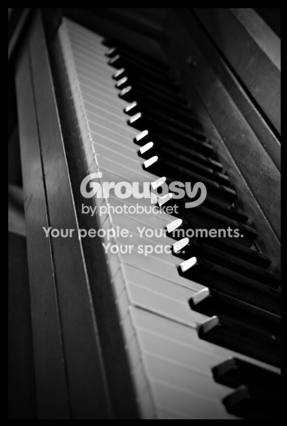
i tried the exposure bump, and it's minimal... if any. loses detail quick, i like it as is. same with the contrast, makes it to edgey. i like that the highlights are on the black keys, not the white ones. the white ones still have a nice feel with the highlighted edges though. as an image of a childhood piano, i think a brighter higer-contrast image loses it's emotion. good job with this one.




![[No title]](/data/xfmg/thumbnail/37/37604-7ad625e983f92f880eb65a264eeef5e4.jpg?1734170732)
![[No title]](/data/xfmg/thumbnail/32/32937-a884897f1671b4bfa4a955c9e4b7e574.jpg?1734162741)
![[No title]](/data/xfmg/thumbnail/41/41934-5071025280901954ee561590003df10e.jpg?1734176289)
![[No title]](/data/xfmg/thumbnail/39/39188-ef8378fc9359eda8e99899c2e12f3892.jpg?1734173063)
![[No title]](/data/xfmg/thumbnail/39/39186-88f5235eacfd57deab14674ccf8e7f0a.jpg?1734173061)





![[No title]](/data/xfmg/thumbnail/32/32935-452d7573a35ee2f5d0b9ad6463de680e.jpg?1734162731)