What's new

This Is What I Came Away With (C&C)

Skedaddle

TPF Noob!
Joined
Apr 12, 2009
Messages
219
Reaction score
0
Location
Where Everything Is Bigger
Can others edit my Photos
Photos NOT OK to edit
I went to a resort for five days earlier this week and I did not have many chances to take photos so this is what I came away with. Is the composition and lighting ok? Are the shots at all interesting?

Thanks for looking. :)

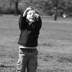
(1) I liked the expression he had on his face.
EXIF
Shutter Speed -1/200 sec
F-Stop - f/2.7
Focal Length - 6.0 mm

3554587282_b5c3cbec3a.jpg


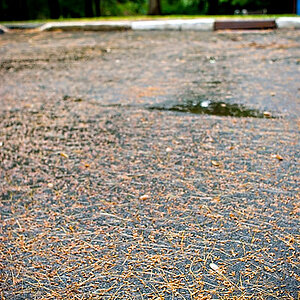
(2) I thought the lighting was interesting.
EXIF
Shutter Speed -1/1600 sec
F-Stop - f/3.5
Focal Length - 30.2 mm

3553781379_c37543990f.jpg


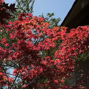
(3)
EXIF
Shutter Speed -1/1000 sec
F-Stop - f/3.5
Focal Length - 64.7 mm

3553781601_4a8489f8ce.jpg


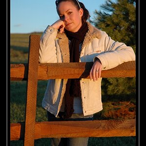
(4)
EXIF
Shutter Speed -1/800 sec
F-Stop - f/3.5
Focal Length - 71.2 mm

3554588178_062220c2ce.jpg
 
I like number one alot you really nailed that one nicely. It has great color and, the exposure it right on. Number three is a great stop action and, it works great as well. Especially considering you are using a P&S. I see so many that are terrible on action. The other two photos I have ne real opinon on as the subjects dont do anything for me. Number two on the ineresting lighting either works or doesnt. I have tried several times to get those shots and, rarely do they look as good as the moments I took them. They are almost you have to be there shots.
 
I am going to start with #4, because I freakin' love it. I love the details in the reflections. I love how criSp it is and really captures the fluidity and play of light and water. Very nice.

#3 the colors look perfect, very real. I like the capture of the "water curtain" coming off her arms.

#2 is only mildly interesting to me.

#1 Great face! I'd love this so much more if the person behind wasn't him, or wearing such a distracting outfit. :-P I think the light looks great, and this is an interesting shot. I love his expression, and I think it would convey much more if he were alone.
 
#1 I love the expression on the little boy's face. So sweet. I wish the other person (child) standing behind him wasn't in the shot too, but I know there is nothing you can do about that. You either catch the expression or you wait for the background to clear and you miss it. The lighting is great and you really nailed that focus on the eyes! Nice work.


#2 Now that I have an external flash, I work really hard at avoiding light and dark patches when taking pictures. I'm working on using my flash to fill those spots. So, of course, I'm going to look at that and go..aha..could have used flash!! ;) Of course, this was not what you had in mind. Just my thought process when I saw it. I like the greens and you did a good job with your rule of thirds :)

#3 This one is great. You really captured all of those tiny drops of water under her arms. The colors are nice and you found some nice soft light. Again, unfortunately, you have the distraction factor with the little boy and the shoes and other "stuff" in the background.

#4 is lovely. I like the colors and the texture of the ripples. The problem (for me) is the lack of subject. If there had been a bright yellow duck or vivid red ball in the corner of the frame it might have really struck me.

These are so nice for a P & S..way better than a lot of dslr pics I've seen (including MANY of my own!)
 
I really like number 4 in terms of potential. Very crisp and great color. A clear subject IMO would have given it the impact it needs.
 
Thank you all for the comments. :) For the first photo, the girl had to be in the background to hold the baby up because he is unable to sit on his own yet. Also, I took a couple other photos of him without the girl in the photo but for some reason I like it better with her in the photo. As for the second photo, I could try and clone out the patches of light except for the one lighting the ball. Would that work? On the third photo, I really liked how it looked as though she had water wings. :) In photo number four, I wanted the water to be the focus so that is why nothing else is in the photo. :)

Anyone else?
 
Photo 4 is the one I really like very much for all the reasons that also Bitter Jeweler and linpelk have described. A red ball on the surface could have added that tiny bit of "subject", but I do like this as the "abstract water colour" that it is, too. Quite much so!

It is difficult with compact digital cameras to really nail action shots such as the one in 3 as well as you did, and their lag between release and action is usually quite long! (It is only a fraction of a second, mostly, but that may AS WELL still be too long). So well done on that one.

I see why you were fascinated by the light situation in Photo 2, but it does not transport itself quite as well to the viewer as you may have thought, I think. If the golf ball had been yellow ... or any other colour but green ...!?!? :scratch:

And the little boy thinking highly philosophical thoughts about the ways of the world (he looks like it! ;)) is your son?
 
Thank you for the comments. I agree about the ball color. I hadn't thought about having it a different color. No, the little boy isn't my son. He is one of my younger brothers. :)
 
I don't really have much to add except that I love the expression on #1, great motion stop on #2--I bet it looks really nice at about 35% size. #3, meh. #4 is really interesting. It's one of those "fish tank" pictures--you could look at it for a long time, but not really know exactly what to look at. However, you wouldn't really care.

Good work! Keep it up!
 
i like your last photo the best, gives a serene feeling
clear.gif
 
I think LuckySo was mistaken... in that he referred to your second photo as the third and third as second. ;)

For me, I pretty much agree with what has been already said:
The first shot goes pretty deep. The boy's (your brother) really is a good model for this, and as unfortunate as the girl being there is, his eyes! They entrance. Very nice.

Second photo is a bit of ~ for me. Technically this is fine, creatively not really. Consider moving to somewhere else - yes the dappled nice might look nice but consider if it's really one of your best shots.

Third photo - very nice, could be improved but you should still be proud with this.

Fourth, you need a subject. Certainly, the colours are nice, but it leaves you a bit hanging.

But it's fine for someone your age, which I infer if that little boy is your brother! :)
 
Thank you for the comments. On last photo, I wanted to go for a more abstract look which is why nothing else is in the photo. As for the first photo, would it work if I tried to clone the girl out? I'll try playing around with it and see what I come up with.

Anyone else?
 
The first three seem like nothing more than snapshots to me.

#4, though, I like a lot.

#1: Cluttered background. What isn't cluttered is boring. Nicely exposed, though.
#2: Does nothing for me.
#3: Just a snap of a girl playing in a pool. Cluttered background, not very interesting.
#4: Beautiful colors, interesting patterns, good lighting.

Jon
 
Fourth, you need a subject. Certainly, the colours are nice, but it leaves you a bit hanging.

I can certainly see how a subject added to #4 would work, and work well, if you intended to have focus on something else. But #4 works as an abstract, it has a lot going on that you can get lost in without having a subject. I do believe abstraction in photography is as "love it or hate it" as it is with any other form of abstract art. Most people don't get it because it relies more on the composition itself, rather than subject.

Hmmm... is there a thread people can post pics and discuss this topic?
 

Create an account or login to comment

You must be a member in order to leave a comment

Create account

Create an account on our community. It's easy!

Log in

Already have an account? Log in here.

Back
Top Bottom