It's under exposed a full stop 1.5 stops because all the white biased your camera's light meter.
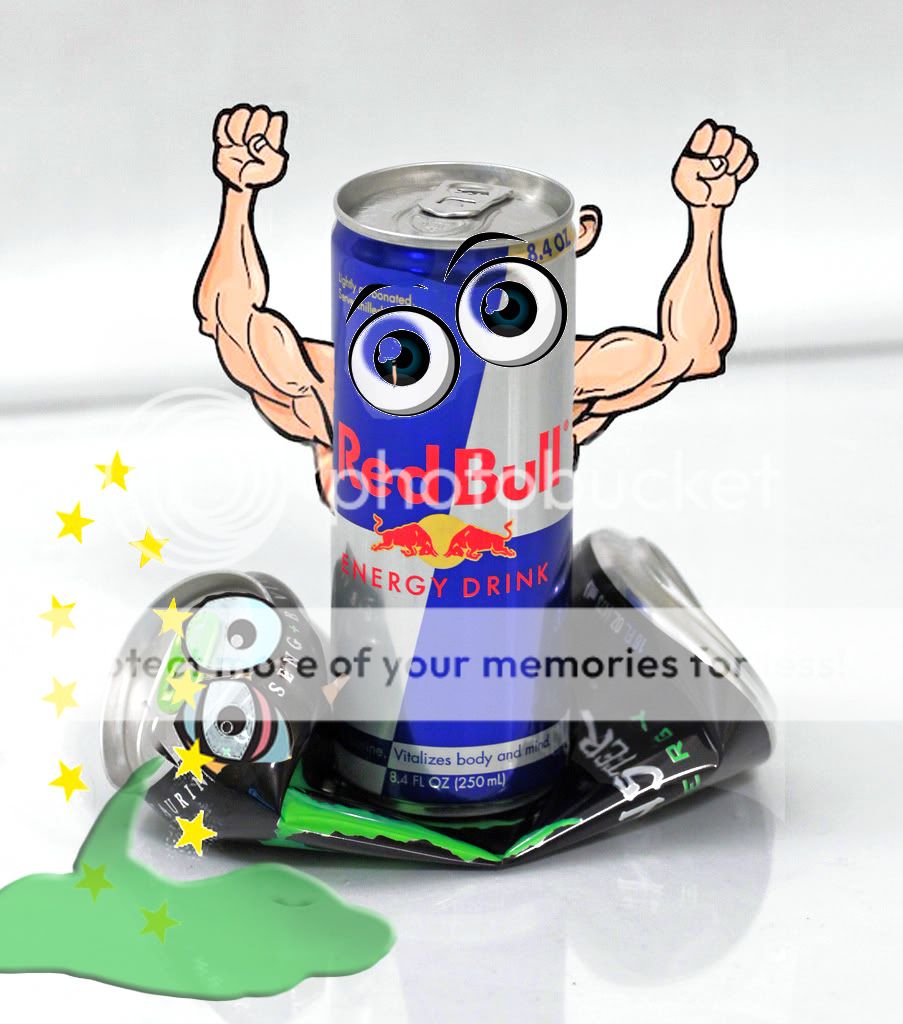
From a composition stand point the main subject being in the middle of the shot makes it difficult to place advertising copy. If I was Red Bull, I would want the other product to have less visual weight, particularly that distinctive green color.
the only extra sheets I had were those white ones! :lmao: lol
I had some that were exposed more but the silver on the can was too light, almost white and just didn't love it. I understand your point though, I may try it again and I definitely appreciate the suggestions.
I'm not sure that I agree with your composition point, only because I wasn't shooting from the position of being a red bull marketing guy, I was shooting it more as a energy drink consumer with strong opinions if that makes any sense. For sure if I were doing it for Red Bull, I wouldn't use that Monster can, especially not bringing out the bright green. I used the Monster can because I'm not so much trying to sell Red Bull as I am conveying my opinion of it. And if it had been for marketing purposes on behalf of Red Bull, there would have to be something more interesting going on, I think.
I do like the idea of the Monster can oozing green blood, I may very well try to do something with that! I actually had the original water bottle still filled with some water, and some drops coming out of the bottle, some on the table (it's all sitting on a sheet of glass on top of the sheet). I thought about doing something like it with the Monster but I forgot that Monster is brown like red bull so it wasn't a good color.
Now, the way I was coming at it might not have been the way I SHOULD have been, I'm just saying why I did it like that.


![[No title]](/data/xfmg/thumbnail/37/37605-90c8efaef5b7d1f52d4bf8e7dfd33673.jpg?1734170732)


