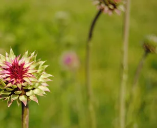
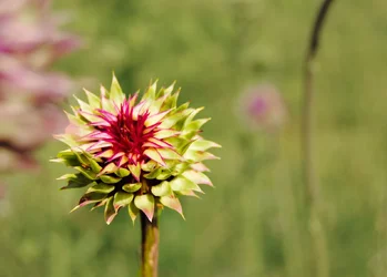
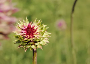
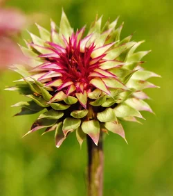
It's a good solid image with tack sharp focus, great exposure and what appears to be accurate color.
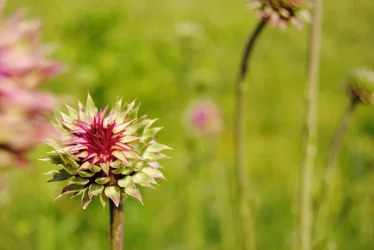
I went to the super size of this to really get a look at it. It's got a DOF that is a bit too shallow. The front side of the thistle is in focus, but not the entire thing. I wish the entire thing were in focus. Because of the shallow DOF the back half of the thistle is beginning to blend into the background.
I wish the background had more separation in the color from the thistle and I probably would have toned down the background just a touch in color to create that separation.
The placement is a little awkward. The thistle is leaning to the left and it's placed to the left of the image. While it's placed fine for rule of thirds, it would have given the feeling that the negative space balanced more if the thistle were placed at the right side of the image.
I'd crop out the thistle to the top edge of the image. It's a distraction.
Now, being as I said those things doesn't make it a BAD image. That's just the things that I'd have done differently or to give the image more impact.



 You definitely have a point about cropping out the one thistle. I will play around with in PS and see what it looks like with more separation.