Thoughts on these snaps, please.

ronlane

What's next?
Joined
Aug 3, 2012
Messages
10,224
Reaction score
4,961
Location
Mustang Oklahoma
Website
www.lane-images.com
Can others edit my Photos
Photos OK to edit
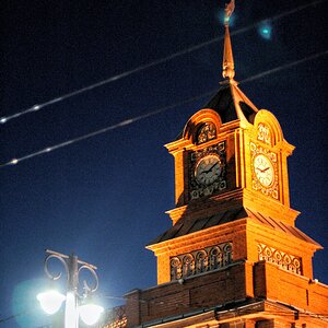
New here and have been posting a couple of comments. Thought it was time to post a couple of pictures, so I took a couple this evening. Still have a lot to learn on taking photos and with post processing. Looking for some input and help if you don't mind. Thanks.

Taken with a Canon T3i, 55-250 mm, polarized filter and a hood.


Vine in the flower bed by Ron_Lane, on Flickr


Vine in the flower bed 2 by Ron_Lane, on Flickr


Vine in the flower bed by Ron_Lane, on Flickr
 
Briefly:
The first needs some levels adjustment...it should look more like the second IMO. Compare the colors of the brick wall background....the first should look like the second...or the other way around :). To me...the first light looks too cool...the second too warm...I suggest finding something in the middle. The composition on the second is a problem. You chopped off the back of the subject...and there is too much empty space on the left IMO. While looking at it, I actually tipped over to my right and fell off the chair because the weight of the image is pulling that way ... LOL. The leaves at the top of the vine appear on my screen to be OOF. That's all I got man.

:biglaugh: Seriously? Dude, I thought only *I* did things like that.
 
I'll take a picture of my rug burns to prove it :lol:
 
You said it yourself... they are snaps. Lot a lot to them compositionally. Not much to draw us in emotionally. Not much to comment on.
 
They are snaps, as Manaheim already noted. But they have the seeds that can lead you somewhere interesting. But first, you'll have to take the finger off the shutter button, and lower the camera. Maybe even put it down. Now, back to your subject... what was it that got your attention originally? Is is the curve of the metal holder? Is it the contrast of the green foilage against the red of the brick? Whatever it is, your job as a photographer is to see if you can emphasize THAT particular aspect, and use the photographic tools at your disposal (exposure, depth-of-field, focus placement, etc.) to emphasize that aspect, while minimizing all those that would compete or distract. It may require a different vantage point, and it may require some additional light. But by thinking about the image, what appealed to you, and how to communicate to your viewers (who are limited to the boundaries of your image) the clues of what you want them to look at, you create a more powerful image.

Have a look at the quote I borrowed from Lew (in my sig below), and think about how to apply that simple advice to make powerful images.
 
My bet is that you were drawn to the vine on the curved metal bar.

By shooting in color, and not being careful about the backgrounds, you have similar colors of the vine against the out of focus greenery in the background, so the vine doesn't get the emphasis is wants. Apart from that, I quite like the composition in the second one. It's not a great commentary on man's inhumanity to man, but it's a peaceful and elegant still life.

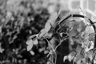
Conversion to b&w allows a little better separation, since the tones are quite different, it's the colors that are blending. Better still would be to move and get the background better!

$vine.jpg
 
I burned the background down a little, just to make that area behind the leaves a little darker. The b&w conversion is just whatever GIMP gave me, so there's nothing special about that (I think I chose "luminosity" over "value" -- whatever the heck THAT means -- since it gave me brighter leaves)
 
I burned the background down a little, just to make that area behind the leaves a little darker. The b&w conversion is just whatever GIMP gave me, so there's nothing special about that (I think I chose "luminosity" over "value" -- whatever the heck THAT means -- since it gave me brighter leaves)

"Value"(in GIMP 2.7 "Lightness") is how light the pixels are. Luminosity is how bright they are. Luminosity gives more accurate results.
 
I liked the second image of yours... a nice application of wide aperture... if you had that brick wall through out in the background, the image would have been better, i feel
Regards :D
 

Most reactions

Back
Top