You are using an out of date browser. It may not display this or other websites correctly.
You should upgrade or use an alternative browser.
You should upgrade or use an alternative browser.
thoughts on these :)
- Thread Starter er111a
- Start date
timlair
TPF Noob!
- Joined
- Aug 14, 2010
- Messages
- 225
- Reaction score
- 1
- Location
- Kansas City
- Can others edit my Photos
- Photos OK to edit
I'm pretty freaked out. And thats a GOOD thing. Great shots. Very unique. The bed is a little off center but you mighta been going for that. Im not sure. Still like it.
SecondShot
TPF Noob!
- Joined
- Jul 12, 2010
- Messages
- 167
- Reaction score
- 3
- Location
- Maryland, US
- Can others edit my Photos
- Photos OK to edit
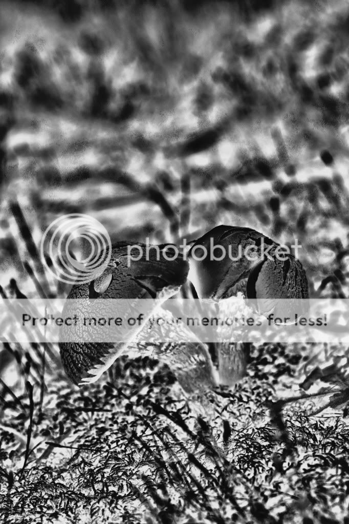
#1 I like this - very different, unexpected.
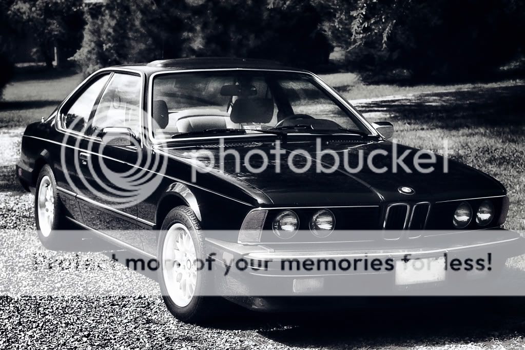
#2 Nice shot, but the shadows in the front grill remove any detail there.
#3 I think i'd like it more if the color from the selective didn't appear to be bleeding past its boundary.
#4 Does nothing for me.
#2 Nice shot, but the shadows in the front grill remove any detail there.
#3 I think i'd like it more if the color from the selective didn't appear to be bleeding past its boundary.
#4 Does nothing for me.
PerfectlyFlawed
TPF Noob!
- Joined
- Feb 2, 2010
- Messages
- 2,408
- Reaction score
- 19
- Location
- Tempe, Arizona
- Can others edit my Photos
- Photos OK to edit
Well to most of us....we already knew what to expect opening this thread LOL....
I like them...they're always different. Never cliche! Kudos to being different
I like them...they're always different. Never cliche! Kudos to being different
RobNZ
TPF Noob!
- Joined
- Jan 17, 2010
- Messages
- 543
- Reaction score
- 2
- Location
- New Zealand
- Can others edit my Photos
- Photos OK to edit
Im going to go the opposite of SecondShots thoughts.
1, 2 and 3 do nothing for me.
4 however, made me go wtf and smile a little and question it, excellent!!
1, 2 and 3 do nothing for me.
4 however, made me go wtf and smile a little and question it, excellent!!
abnormalreply
TPF Noob!
- Joined
- May 1, 2010
- Messages
- 91
- Reaction score
- 0
- Location
- New York, NY
- Can others edit my Photos
- Photos NOT OK to edit
1- it seems way too over-processed which caused the subject to become less noticeable
2- I like it 'cause I like BMWs =]
3- This comes off as pretty bland to me.
4- I like this one. I'm not sure why, but I'm drawn to this one more than the others
2- I like it 'cause I like BMWs =]
3- This comes off as pretty bland to me.
4- I like this one. I'm not sure why, but I'm drawn to this one more than the others
PerfectlyFlawed
TPF Noob!
- Joined
- Feb 2, 2010
- Messages
- 2,408
- Reaction score
- 19
- Location
- Tempe, Arizona
- Can others edit my Photos
- Photos OK to edit
My favorite is the bed shot  I'd change the heart collor though to red or pink (but that's just me)
supraman215
TPF Noob!
- Joined
- Oct 25, 2006
- Messages
- 979
- Reaction score
- 12
- Location
- Philadelphia
- Can others edit my Photos
- Photos OK to edit
#2 love the car. Classic 635.
KenC
Been spending a lot of time on here!
- Joined
- Jan 18, 2010
- Messages
- 5,699
- Reaction score
- 1,472
- Location
- Philadelphia
- Can others edit my Photos
- Photos NOT OK to edit
I like #1 and #4. On #1 it might be interesting to decrease the contrast of everything other than the mushrooms to bring them out more. Good choice on the coloring in #4 - makes it work better than a straight bw would've.
Texas Aggie
TPF Noob!
- Joined
- Jun 18, 2010
- Messages
- 147
- Reaction score
- 0
1. I'm not a huge fan of this. I don't know. I just don't like the infrared effect on this. Maybe more contrasting color would have looked better for me.
2. I like it.
3. Nice effect. I like it a lot.
4. Not sure about it. I'd probably like it a little more if it didn't look so soft. Maybe a tad more contrast between the banana, the string, and the background would have been better.
2. I like it.
3. Nice effect. I like it a lot.
4. Not sure about it. I'd probably like it a little more if it didn't look so soft. Maybe a tad more contrast between the banana, the string, and the background would have been better.
aprhockey
TPF Noob!
- Joined
- Jul 19, 2010
- Messages
- 83
- Reaction score
- 0
- Location
- Montreal
- Can others edit my Photos
- Photos OK to edit
I like #4... but that's coming from someone who has a poster of a banana hanging in my room. I kinda wish the banana had a nice yellow color or if the background was a bit lighter so the banana didn't blend in as much.
DanFinePhotography
TPF Noob!
- Joined
- Aug 13, 2010
- Messages
- 680
- Reaction score
- 0
- Location
- Redmond, OR
- Can others edit my Photos
- Photos OK to edit
#2 is pretty cool. #4 is unique :thumbup:
Stormchase
No longer a newbie, moving up!
- Joined
- Oct 6, 2009
- Messages
- 1,191
- Reaction score
- 108
- Location
- Phoenix Arizona
- Can others edit my Photos
- Photos OK to edit
er111a, you have created your style. I call It "haunting" and some of your stuff is comming out cool. Regardless of what people think you need style.
Could be good to stray from it now and then but in time...
1 I like but its a ittle too contrasty for me.
4 is cool. I like it a lot. Your ps works well for it and what you went for!
Could be good to stray from it now and then but in time...
1 I like but its a ittle too contrasty for me.
4 is cool. I like it a lot. Your ps works well for it and what you went for!
Most reactions
-
 201
201 -
 177
177 -
 157
157 -
 129
129 -
 122
122 -
 106
106 -
 105
105 -
 103
103 -
 100
100 -
M
90
-
 89
89 -
 84
84 -
 64
64 -
 61
61 -
 54
54
Similar threads
- Replies
- 7
- Views
- 267
- Replies
- 0
- Views
- 539


![[No title]](/data/xfmg/thumbnail/34/34118-1c18899050bfacc1ed25ac6c1740422b.jpg?1734164585)


