Navigation
Install the app
How to install the app on iOS
Follow along with the video below to see how to install our site as a web app on your home screen.
Note: This feature may not be available in some browsers.
More options
You are using an out of date browser. It may not display this or other websites correctly.
You should upgrade or use an alternative browser.
You should upgrade or use an alternative browser.
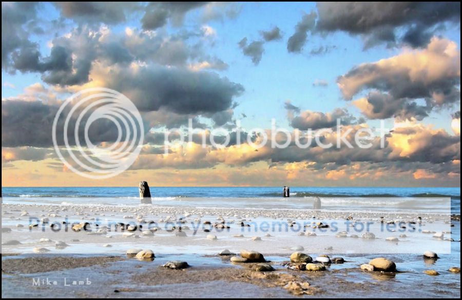
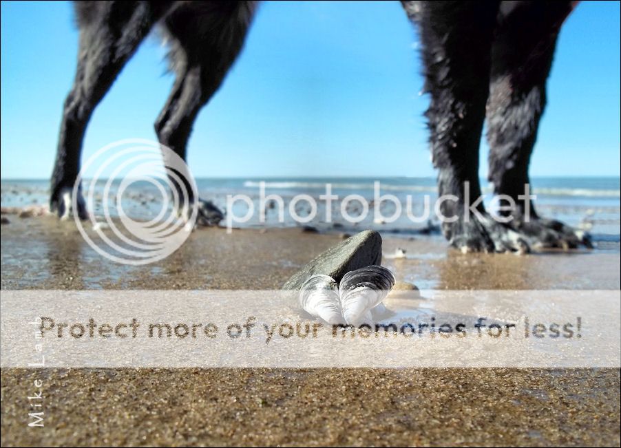
Three Beach Shots of Lake Michigan
- Thread starter Mike Lamb
- Start date
Frequency
Been spending a lot of time on here!
- Joined
- Oct 17, 2010
- Messages
- 8,864
- Reaction score
- 683
- Location
- Calicut, Kerala,India
- Website
- www.photosenzitive.com
- Can others edit my Photos
- Photos OK to edit
My favorite is the second.....
First one has an over sharpened look-a bit. ; yet could very well create some heavy mood
Third one is a unique shot; like this too

First one has an over sharpened look-a bit. ; yet could very well create some heavy mood
Third one is a unique shot; like this too
Joel_W
TPF Noob!
- Joined
- Dec 9, 2011
- Messages
- 2,211
- Reaction score
- 164
- Location
- Long Island, New York
- Can others edit my Photos
- Photos OK to edit
Picture 1 is very dramatic. Try lowering the horizon to the 1/3 point to further emphasize that dramatic sky. Picture 2 is a nice seascape. Well exposed, and has a nice feel to it. I really don't understand picture 3. You're too far away from the sea shells/rocks to make them a strong main subject, which has nothing to do with the dogs legs.
Last edited:
invisible
Been spending a lot of time on here!
- Joined
- Mar 10, 2007
- Messages
- 5,213
- Reaction score
- 983
- Location
- Canada
- Website
- www.federicobuchbinder.com
- Can others edit my Photos
- Photos NOT OK to edit
The first one is the cream of the crop for me, I really like it. I do agree with Frequency about it being oversharpened, to the point that the water doesn't even look like water anymore. The horizon is 1 or 2 degrees crooked an easy fix. I personally would've preferred the reds to be less saturated, but then again this is the artist's choice. The top purple streak looks a bit unnatural to me though, not sure how that happened. I also think you went a bit too far in the processing of the clouds, the top-centre portion being the most overcooked. But like I said, most of these are artistic choices so mine is just one opinion.
Number 2 I find too busy, to the point that my eyes don't know where to look or where to go from there. I would either crop the top 40% (making this a panorama in which the sand/rocks are the clear subject) or the bottom 15-20%. Once again, a personal opinion.
I find #3 interesting, it kinda tells a little story, which I like.
I hope you don't find my C&C too harsh. If I hadn't found these images interesting I would've just moved on without commenting.
cgipson1
TPF Noob!
- Joined
- Aug 18, 2011
- Messages
- 17,142
- Reaction score
- 4,350
- Can others edit my Photos
- Photos NOT OK to edit
#1 is cool... I like it, even with the oversharpening.. gives it a textured look that I like! Almost painted!
#2 Busy.. not much there.. hard to say where to focus.. no real subject
#3.. don't care for this one....
#2 Busy.. not much there.. hard to say where to focus.. no real subject
#3.. don't care for this one....
Most reactions
-
 213
213 -
 191
191 -
 185
185 -
 185
185 -
 175
175 -
 155
155 -
 141
141 -
 126
126 -
 123
123 -
 94
94 -
 78
78 -
 78
78 -
 76
76 -
 74
74 -
I
67
Similar threads
- Replies
- 8
- Views
- 208


![[No title]](/data/xfmg/thumbnail/32/32150-7445fc014b4b484b24ba067189aa45b6.jpg?1619735233)


![[No title]](/data/xfmg/thumbnail/41/41896-54547e935773393100a20b8d9819f5bd.jpg?1619739935)
