What's new

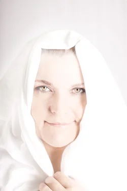
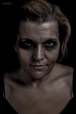
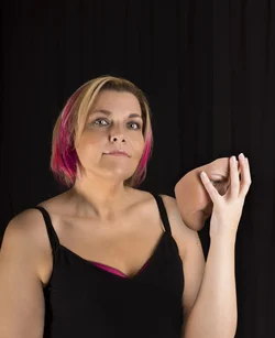
Three very different images...The good, the bad, and the faceless. (female) ;-)

tibrunner

TPF Noob!
Joined
May 22, 2011
Messages
162
Reaction score
15
Location
Vancouver, Washington
Can others edit my Photos
Photos NOT OK to edit
I was hoping to receive some C & C on these three, this was also my first attempt at high key.

Thank you

$DSC04144.webp$DSC04191.webp$DSC04116.webp
 
I like them all.

1. The shadow on the right is distracting.
2. Could bring up contrast without sacrificing dark feel.
3. The bra top is taking away focus, too much space above head.

Otherwise very good examples of different lighting styles.
 
Thank you, I will fix the shadow on the left, and you are completely right about the bra, it hadn't even occurred to me to remove it.

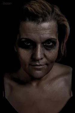
here is the original darker image before I brightened it. Does it still need more contrast?

$550489_621077957909454_1811831839_n.webp
 
C&C per req:

1. Strictly speaking, since this has a lot of blown white, it's not actually high key, but it is close. The catchlights indicate a rather atypical lighting set-up for high; remember to light the subject separately from the background and to allow for good separation between the two. Typical 1 to 1.5 stops over is ample for the background, and remember to have your highlights on your rear LCD to check for blown areas.

2. I like this; I think this is really well lit, but a bit tightly framed. If you'd opened up around the subject just a bit, this would have been great.

3. To be honest... ho-hum. YOu need to raise your lights and your shooting position. "Up the nose" is almost never a flattering view! Unfortunately, you've also missed focus; the "mask" and left hand are tack-sharp, but the subject's face is soft, and again, she's rather tightly framed.

Overall, not bad; minor issues which are easily corrected.

Just my $00.02 worth - your mileage may vary.

~John

 
aye #1 is way overblown, #2 slightly under i would say, though i know you did that to portray the darker bad side... #3 is alright...
 
aye #1 is way overblown, #2 slightly under i would say, though i know you did that to portray the darker bad side... #3 is alright...

#1 was my first attempt at high key..it's supposed to be "blown out" while still retaining detail in the focus area.

#2 I feel is evenly lit exactly where it needs to be, I played with various exposure edits because the picture will obviously appear different depending on the screen it is viewed upon. Case in point my Retina MBP vs my older Sony Vaio - there was a massive difference between the two displays.

#3 thank you for your enthusiasm ;-)
I know the face is out of focus, I could make an argument that it was intensional to draw more focus to the hand- but I know it was not. It was a batched shot on my part. So I did what I could with what I had and I think it ended relatively ok.
 
I must of misunderstood "I was hoping to receive some C & C on these three"

You are right, I apologize. Thank you for your comments. Would you by chance have any constructive criticism of how I can shoot them better in the future?
 
I do like the first two. I don't have much to say about them.

The concept and execution on the last one is pretty good as well. The weakest aspect is the lighting, which seems fairly flat and kind of ghoulish (possibly because you didn't have it high enough?) Judging from the catchlights, the light sources was about level with her, while I think it would have been more striking and appealing if the light source had been higher above her.

And even if the light was slightly her, generally it's worked for me to make the light 1/3 of model's body length above them (unless the model is like 9 ft tall or something). It may not be "technically correct" according to the photography books, but it works for me most of the time.

Also consider adding a second light source behind her on the opposite side of your keylight in photos like the last one. It would help to make your model pop against the background and would draw more attention to her.
 

Create an account or login to comment

You must be a member in order to leave a comment

Create account

Create an account on our community. It's easy!

Log in

Already have an account? Log in here.

New Topics

Back
Top Bottom