

rokstomper
TPF Noob!
- Joined
- Aug 2, 2012
- Messages
- 153
- Reaction score
- 16
- Location
- California
- Can others edit my Photos
- Photos OK to edit
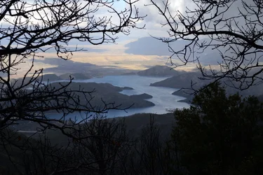
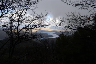
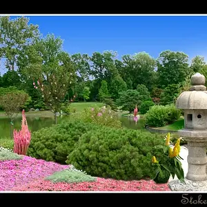
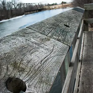
I thought these were kind of interesting, what do you think? It is silverwood lake in California.
1.
2.
1.
2.


![[No title]](/data/xfmg/thumbnail/39/39438-1eb8b5f82b59d9d0c72ae9025778ed4c.jpg?1734173528)
![[No title]](/data/xfmg/thumbnail/35/35948-700e0d840da0ca73727b1bd6d99b4142.jpg?1734167751)
![[No title]](/data/xfmg/thumbnail/36/36670-546c6128f51bbe69923c2eb6fd4fa438.jpg?1734169173)
![[No title]](/data/xfmg/thumbnail/35/35947-ab35bfc67d8e12ce65dda301d3bf2b66.jpg?1734167744)
![[No title]](/data/xfmg/thumbnail/40/40356-883c642c8d24d2709b359f9c8b196fcf.jpg?1734174788)
![[No title]](/data/xfmg/thumbnail/36/36668-ac1cd3882e96edd642d568c48ed3e7a5.jpg?1734169172)