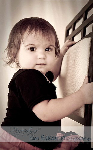
Your dd really is super adorable! =) The 4th one is my favorite.
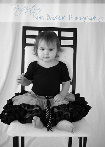
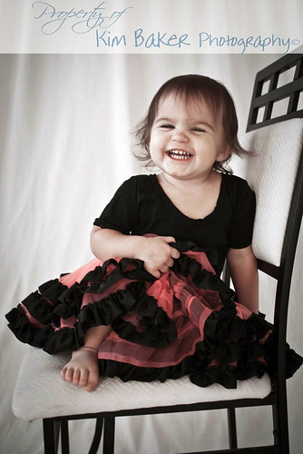
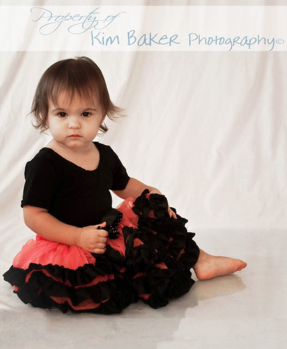
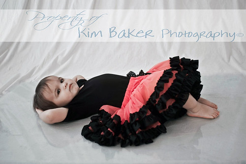
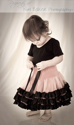
You've posted a bunch of times using this same set up...and if you're tired of me giving the same CC, please just ignore me...or tell me to shut up. I won't be offended. But, really the wrinkled background and plexiglass lines are distracting. White is a really difficult background to work with, especially when using cloth and not seamless paper. Without a dedicated light, it's harder to prevent it from looking gray or yellow, and the wrinkles only emphasize it...it's not as bad in #4, but in #5, it's more difficult to stay focused on your dd, without my eyes wandering to the edge of the plexiglass and then up the backdrop.




 My world will rock then. :lmao:





![[No title]](/data/xfmg/thumbnail/39/39443-45e1b162b6c7c1d8ebbc8faf5623b705.jpg?1734173533)
![[No title]](/data/xfmg/thumbnail/39/39446-903cfeac143cee6330a51546ecfdda92.jpg?1734173536)