batmura
No longer a newbie, moving up!
- Joined
- Sep 19, 2012
- Messages
- 649
- Reaction score
- 240
- Location
- Istanbul, Turkey
- Can others edit my Photos
- Photos OK to edit
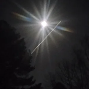
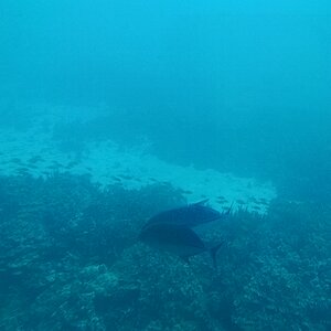
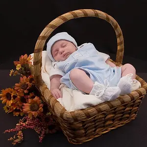
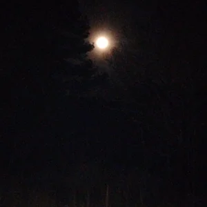
Any C&C about these two images is most welcome. Do you prefer the B&W version or colour? Any other suggestions or comments?
#1

Riva-December 3 by batmura, on Flickr
#2

Riva-December 4 by batmura, on Flickr
#1
Riva-December 3 by batmura, on Flickr
#2
Riva-December 4 by batmura, on Flickr




![[No title]](/data/xfmg/thumbnail/37/37624-7f9c9a5c8c7bcb5e62f67313e2e48dbc.jpg?1734170748)