To High? To Low?

rwebbart

TPF Noob!
Joined
Nov 3, 2006
Messages
74
Reaction score
0
Hello all you nice folks! Been reading but this is my first post. I hope to contribute here a lot. Anyway, on to my question.

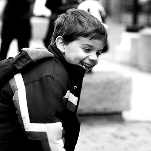
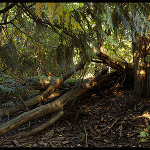
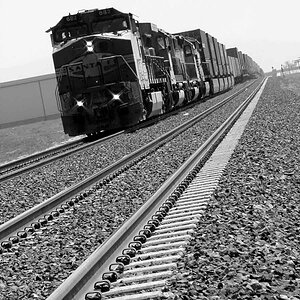
This photo was taken in color but I was "seeing" B&W when I shot it. I have continued to adjust it but can't seem to get it to look less like a gray image and more like a B&W. I am afraid I have blown the highlights to far out in the process. Let me know your thoughts please.

It is (OTE) OK to edit, so I'll try and post the original later. Thanks for your help.

belvadere.jpg

OK, I have added the original.....
belvadere.jpg
 
belvadere.jpg


Used Channel Mixer in PSCS as well as the burn tool to bring out the shadows
 
Thanks, I think that I have just been looking at it too long. Now that I put the color file next to my black and white (which looks more like a split tone) I can see I ended up right back where I started.

I liked your selective use of the burn tool. Thanks again. I'd be interested to see anyone elses take.
 
Another thought...in PhotoshopCS

Try Image>Adjustment>Desaturate, then use Image>Adjustment>Shadow/Highllight to adjust the highlights and shadows to your satisfaction ;)
 
Actually I fear that you can only "repair" this one so much and no further as it is a little overexposed to begin with (if the second version that we see here is the original photo from where you started). I would like to "play" with it a little, too, if I may, but I fear that the side of the car is "gone".

More than that I am not sure I am ever so happy with your composition here. The little strip of background above the bonnet (is that the word ... would it be "hood" in American English?) bothers me ... I might feel like cropping that part off so focus is more on the lights only... says who never does any car photography ever at all :blulsh2: ...
 
OK. I was wrong. The side is more salvageable than I thought: I threw the lasso tool around it at a 180px feather and adjusted the levels for that part separately and was surprised how well it worked.

After I totally desaturated the pic, I adjusted the levels for the now b+w pic (as a whole) more to add some more contrast (doing that via contrasts did not work that well), so this is the purely b+w version:

rwebbart_belvadere_myedit_BW.jpg


And then I really like the "sepia" version, mildly tinted (I push the levels for the midtones in the red channel from 1,00 to 1,10 for that, and the same with the blue ones from 1,00 to 0,90), so that is my tinted version (which I sharpened additionally with USM = unsharp mask at 30% ... for the photo is already very small):

rwebbart_belvadere_myedit_BWtinted.jpg


Do you like my edits?
 
Thanks for spending so much time on it! I really like the second one. I replaced the color picture in the first post with a slightly different version I found on my backup drive.

I think it might actually be the original. The problem is I have been stuck on this for so long it has gotten lost on me. I know there is a decent picture in there somewhere, and you all have helped focus me in on it. Thanks for your replies and any future ones.
 

Most reactions

Back
Top