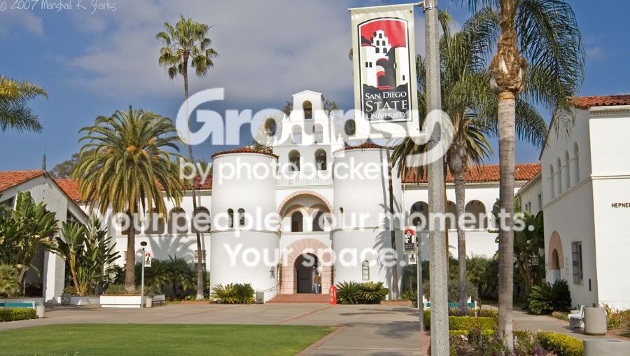
With the photo you are presenting us here I have to agree with The_Traveller on that it is just too busy to be outstanding in any manner.
If you had gone for the comparison of the image of San Diego State University on the banner and its real counterpart, you should have chosen a much narrower angle and probably a vertical frame. I can see how you placed that banner right above the righthand roundtower there, but then I feel your frame should end with the banner pole on the right and before the palmtree to the left of that entrance. That would give the banner some meaning.
As it is, I find it distracting and always feel like stepping more to the left, to the left, to get it out of my vision.





![[No title]](/data/xfmg/thumbnail/32/32170-3fce4409fbea1f5e9818209c7e87c1ea.jpg?1734161046)