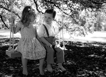
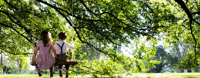
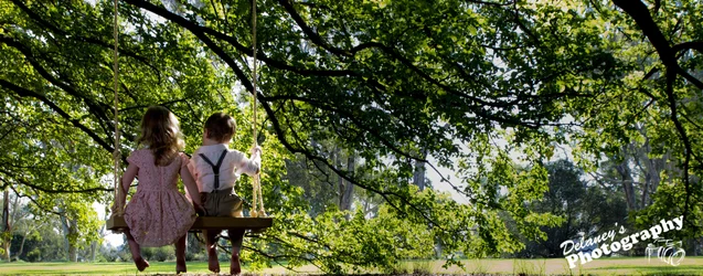
I agree, the right side of #2 is too bright and takes away from the subject.
Were you using any flash? You could have under exposed the back ground slightly and used flash to bring up the light on the toddlers since they are in the shade.
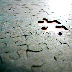
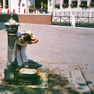
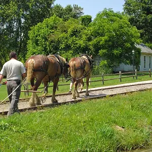
I LOVE number 1!!, everything about it is cool to me. Number 2 isn't working quite as well, as the others have said it is too bright and contrasty (kinda hurts my eyes) annnnd I'd love to see a little more space under their feet. Cute shots though.
I think if it was just cropped in WAY tighter without all that negative space/tree it would be much more appealing (to me anyway)... I think the kids backs still need to be bright but bring the trees and what not down. Just my 2 cents. They are such cute pics regardless.






![[No title]](/data/xfmg/thumbnail/37/37604-7ad625e983f92f880eb65a264eeef5e4.jpg?1734170732)