What's new

Tomo and Lauren

kdthomas

No longer a newbie, moving up!
Joined
Aug 9, 2014
Messages
1,117
Reaction score
474
Location
Denton, TX
Can others edit my Photos
Photos NOT OK to edit
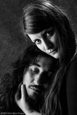
TomoAndLauren-2.webp
 
kdthomas said:

It's a nice dual portrait, high on drama. For me, the background area to the left is too prominent, too bright, and the hairlight on her hair at the top of the frame distracts a bit. I really think that this would have been an absolute home run with the camera aimed over to the right a bit more. Her arm and shoulder area are kind of important, since she's pulling him close to her...that empty space devoted to background is less valuable than more of her would have been.

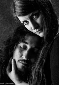
I did a quick crop to see what less background and eliminating the lighted hair at the top would do to this. I think you have a very strong, very obvious skill with B&W imagery of people!

 

Attachments

  • TOMO & Lauren_crop.webp
    TOMO & Lauren_crop.webp
    186.9 KB · Views: 202
kdthomas said:

It's a nice dual portrait, high on drama. For me, the background area to the left is too prominent, too bright, and the hairlight on her hair at the top of the frame distracts a bit. I really think that this would have been an absolute home run with the camera aimed over to the right a bit more. Her arm and shoulder area are kind of important, since she's pulling him close to her...that empty space devoted to background is less valuable than more of her would have been.

I did a quick crop to see what less background and eliminating the lighted hair at the top would do to this. I think you have a very strong, very obvious skill with B&W imagery of people!

I agree that is stronger ... Good advice, Derrel, thanks :)

I actually have a couple more I'll post

Also bear in mind these were done at 4:30 am after an INSANE mosh pit banging screaming house party this guy played at ... Holy smokes ... LOL .... More on that later
 
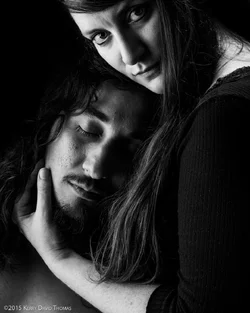
Hey Derrell ... this is another from the same set ... and dang I wish I had busted out the black velvet for this one. Oh well, but I got more of her shoulder in.

I did my best to burn out the background ... is this more like it?

TomoAndLaurenII-1.webp
 
I think this one has good composition...I like the way her hand,wrist,arm,elbow crook, and upper arm and shoulder are all in the shot! That makes a natural, shown, logical place for his head to be! I'm not sure that burning the background down totally was the absolute right choice, since it seems to have cost the hair's definition/separation...I think seeing a small amount of background in the upper left would help, and would give create more of a sense of three-dimensionality, of depth to the portrait-making location. The reason I ddi not like the background in the first shot was because there was so much of it, and it was occupying prime compositional space, but in this shot, with this crop, the PEOPLE are occupying great places! This is a really nice picture! This one will last for years. Decades.
 

Create an account or login to comment

You must be a member in order to leave a comment

Create account

Create an account on our community. It's easy!

Log in

Already have an account? Log in here.

New Topics

Back
Top Bottom