Navigation
Install the app
How to install the app on iOS
Follow along with the video below to see how to install our site as a web app on your home screen.

Note: This feature currently requires accessing the site using the built-in Safari browser.
More options
You are using an out of date browser. It may not display this or other websites correctly.
You should upgrade or use an alternative browser.
You should upgrade or use an alternative browser.
Too dark- or OK?
- Thread starter Peeb
- Start date
- Joined
- Mar 29, 2016
- Messages
- 14,859
- Reaction score
- 8,313
- Can others edit my Photos
- Photos NOT OK to edit
I think the biggest issue is WB, it looks like there's to much red. Here's a quick edit, with a WB adjustment and only +12 on exposure. Might want to adjust your lighting to decrease the specular highlights on the right.

- Joined
- Jul 16, 2015
- Messages
- 4,040
- Reaction score
- 4,661
- Location
- Oklahoma
- Can others edit my Photos
- Photos OK to edit
- Joined
- Mar 29, 2016
- Messages
- 14,859
- Reaction score
- 8,313
- Can others edit my Photos
- Photos NOT OK to edit
dropped the reds -40 and moved the WB a bit 'bluer' and dropped the highlights. Also desaturated since I think it was over-saturation that was lending a 'darkness'. Good thoughts!
Going to the blue side was the wrong way, in the second you're getting there. I haven't calibrated my monitor since the update last week, but the last still has pink overtones. Here's the settings I used
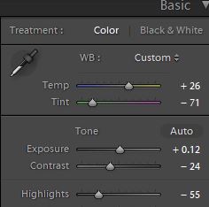
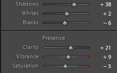


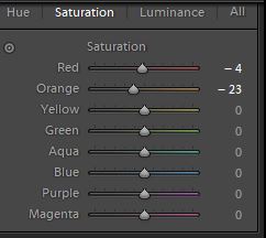
EDIT: Just recalibrated monitor, no change in what I'm seeing.
Last edited:
- Joined
- Jun 13, 2015
- Messages
- 1,671
- Reaction score
- 5,910
- Location
- ...
- Can others edit my Photos
- Photos NOT OK to edit
I think the image looks pretty good, but if you want you could lighten the inside of the pan - so not the entire image - just a tiny bit and brighten (use your curves slider) the orange color a bit. Absolutely no need to start changing color of the fruit, it's fine. And...I sharpened the image slightly.
View attachment 154595
View attachment 154595
Last edited:
- Joined
- Mar 29, 2016
- Messages
- 14,859
- Reaction score
- 8,313
- Can others edit my Photos
- Photos NOT OK to edit
@Peeb If you don't have one of these, I'd highly suggest getting one. I use mine frequently to double check myself
https://www.amazon.com/Cox-133343-C...coding=UTF8&psc=1&refRID=R38TT5J50EWZWDS1R7M5
https://www.amazon.com/Cox-133343-C...coding=UTF8&psc=1&refRID=R38TT5J50EWZWDS1R7M5
As an Amazon Associate we earn from qualifying purchases.
- Joined
- Mar 29, 2016
- Messages
- 14,859
- Reaction score
- 8,313
- Can others edit my Photos
- Photos NOT OK to edit
@Braineack was it your intention to disagree with my edit and if so what part specifically do disagree with?
jcdeboever
Been spending a lot of time on here!
- Joined
- Sep 5, 2015
- Messages
- 19,868
- Reaction score
- 16,081
- Location
- Michigan
- Can others edit my Photos
- Photos OK to edit
I think the original is just fine.
- Joined
- Sep 2, 2003
- Messages
- 34,544
- Reaction score
- 7,570
- Location
- In the mental ward of this forum
- Can others edit my Photos
- Photos NOT OK to edit
Keep comments on topic and minus any snark. It does nothing to actually help the OP to simply slap the "Disagree" button on posts without offering anything tangible in return.
Thanks!
Thanks!
john.margetts
No longer a newbie, moving up!
- Joined
- Dec 3, 2015
- Messages
- 1,100
- Reaction score
- 279
- Location
- Lincoln
- Can others edit my Photos
- Photos OK to edit
I think the white balance is fine in the original post, but saturation is boosted too far.

- Joined
- Mar 29, 2016
- Messages
- 14,859
- Reaction score
- 8,313
- Can others edit my Photos
- Photos NOT OK to edit
@Peeb Adjusting WB in the absence of a reference (something white or a neutral gray) is always difficult. Usually I try to look for a known object to which I can sample for color, in this case the orange in the foreground. True orange (color wheel orange) in web color is a mixture of Red and Green, by the numbers, it is RGB(255,165,0). Citrus orange on the other hand is not true orange it has some green and yellow in it (look at an orange on a tree and you'll see this). Looking at the numbers on citrus orange, the red and green remain pretty close to the same but blue is introduced. The closest numbers I could find for Citrus Orange is RGB(255,176,37).
When I sampled the orange in Peeb's OP I came up with an average of RGB(161,65,10). I could have pulled the image into PS and adjusted by the numbers from there, but instead I did a quick edit by eye in LR. While I got closer to the citrus orange color (mine sampled RGB(221,107,26)) it still isn't quite the ideal, but I wasn't trying to correct the image merely give an example of the direction. With any significant color/hue shift the proper way would have been to use layers with masks, to limit the shift rather than apply it to the whole image.
So, yes in the original image the WB was off. To some degree WB can also be affected by exposure and saturation, and vice versa. By warming the temperature, and adjusting the hue, to the eye it looked brighter. Interestingly @espresso2x touched on a method of selective color adjustment with his suggestion of using a Levels adjustment. If you first open an info panel, then use the color sampling tool it will give you an RGB numerical benchmark. Then open the levels adjustment, select your red, green, or blue channel, and move the center point up or down while watching your info panel, you can see when you reach the RGB numbers you want. @john.margetts also touched on a point when he mentioned saturation. Saturation affects the RGB for any given color, so if you want an accurate color match you need to also watch your info panel while adjusting saturation by channel rather then master.
All this may be more than you asked for when you said "To Dark - or OK", but I was merely trying to point out there was more to the answer than just a bump in exposure, and of course all of this is irrelevant, if the OP was your artistic vision.
Similar threads
- Replies
- 1
- Views
- 211

![[No title]](/data/xfmg/thumbnail/39/39286-ae386da044402acf92e55d8b68c26af3.jpg?1619738956)
![[No title]](/data/xfmg/thumbnail/40/40288-4d5d7a8aa74ddfceb5fb82062d9b21be.jpg?1619739409)
![[No title]](/data/xfmg/thumbnail/33/33024-f9a0cb6482030fec791845de1a21c82a.jpg?1619735837)
![[No title]](/data/xfmg/thumbnail/40/40284-f59f6230f0d5b9eacf977f8b0392f087.jpg?1619739407)
