What's new

Torch of Eternal Life: C&C

Rick58

Been spending a lot of time on here!
Joined
Jun 23, 2012
Messages
4,227
Reaction score
1,473
Location
Reading, Pa
Can others edit my Photos
Photos OK to edit
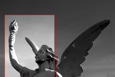
Another day, another cemetery.
 
Last edited:
Interesting. Could use more contrast. Is this in Birdsboro?
 
Yeah, It's in the Birdsboro Cemetery on RT 724
 
Thanks for the contrast input Fan. I received so much feedback :roll: I thought it was worth another run at it. Looking for feedback. Everyone settle down...one at a time...please! :-P
View attachment 22779
 
This composition doesn't work for me, it seems like something is missing and shot against the light is creating flat and weird shadows in conjunction with natural black "stains". I have overall feel of uneasiness. Maybe that is right as it is a cemetery. :wink:
 
The doesn't work for me, I feel the lines leading up and out of the frame. The torch wants to be the center, it's where the figure's sight line goes, but the line of the wing on the right is too strong, that line simply leads me out the upper-right corner.

There's re-enforcement of the gaze-line from the other wing, but also a little visual confusion there, which seems to weaken that.

In summary, since I know how much you despise navel-gazing over analysis: this doesn't work for me.
 
In this picture you are just capturing the upper half of someone else's art without any artistic decision of your own.
The top is empty, the entire right side is the wing; is that important?
Lots of empty space, the body draining out of the bottom, no tension at all.
I think that you should home in on what impresses you and make the viewer see that.

$Birdsboro(3)bllll.webp
 
Thanks guys. I'm not just looking for a pat on the back. If it sucks, I wanted to know that to, and apparently it does :lol:

Just my thoughts, not excuses, while composing this:

Timor: This angel is kind'a creepy. His expression is harsh and I agree with the stains. It adds to the harshness. I first found this guy in the morning with frontal lighing and hated it, so I went back in the late afternoon when the sun was low hoping to backlight the angels wings to add to the dramatics. I guess it didn't work.


Amolitor: Thanks for keeping it english :wink:. The back lit, highlighted wings was what I was aiming for, but I guess I didn't quite pull it off. I knew having this guy on the left side of the frame, looking off the frame, wasn't the best composition, but with the long left wing, I didn't think I had an option, and I really didn't want to lose the detail of that long wing. Again, it apparently it didn't work.

Lastly, Traveler: It's funny I did a crop almost exactly like yours except I moved back a hair more to include the entire back of his head, but I thought for sure someone would comment on his newly acquired pinocchio nose and removing the remaining wing would completely change the meaning of the photo. The empty sky I completely agree with. I wish I would have panned down to include more of the statue and less sky.

Bottom line... :thumbdown:
thanks for the critque. Ya know, who ever heard of an angel with a mustache anyway :lol:

 

Create an account or login to comment

You must be a member in order to leave a comment

Create account

Create an account on our community. It's easy!

Log in

Already have an account? Log in here.

New Topics

Back
Top Bottom