minicoop1985
Been spending a lot of time on here!
- Joined
- Sep 3, 2013
- Messages
- 5,520
- Reaction score
- 1,866
- Location
- Appleton, WI
- Can others edit my Photos
- Photos OK to edit
Went to the track today. Got my panning therapy in. Have a favorite/least favorite? Lemme know what you guys think!
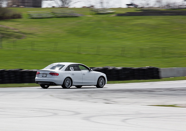 Chris by Michael Long, on Flickr
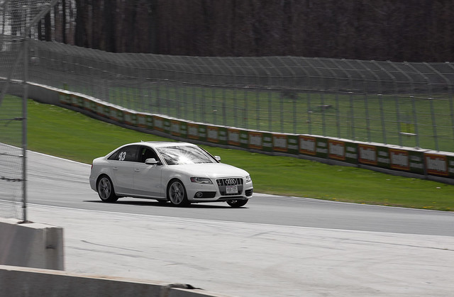 Chris by Michael Long, on Flickr
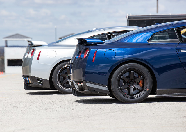 GTRs by Michael Long, on Flickr
 Firebird by Michael Long, on Flickr
 Viper by Michael Long, on Flickr
 Camaro ZL-1 by Michael Long, on Flickr
Chris by Michael Long, on FlickrChris by Michael Long, on FlickrGTRs by Michael Long, on FlickrFirebird by Michael Long, on FlickrViper by Michael Long, on FlickrCamaro ZL-1 by Michael Long, on Flickr
Last edited:

 Viper
Viper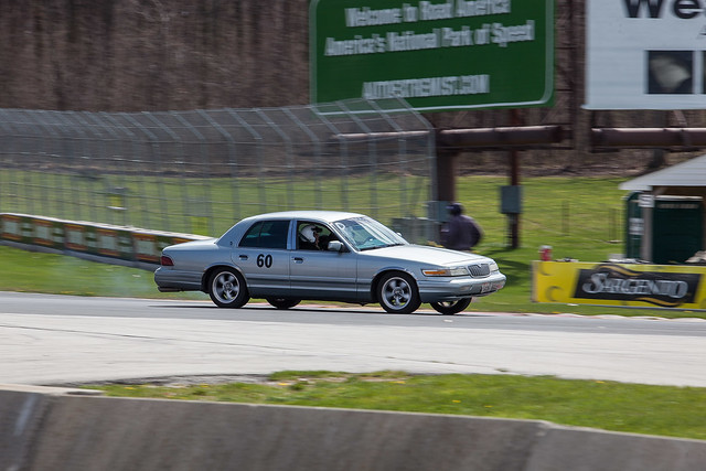 Grand Marquis
 IMG_9942
 Chris
Chris


![[No title]](/data/xfmg/thumbnail/39/39419-5d4fd8535ab4f6e01caa38b72bf396e0.jpg?1734173503)