Tight Knot
No longer a newbie, moving up!
- Joined
- Nov 30, 2010
- Messages
- 1,398
- Reaction score
- 159
- Location
- Boca Raton, FL
- Website
- www.lensphotoworld.com
- Can others edit my Photos
- Photos OK to edit
Follow along with the video below to see how to install our site as a web app on your home screen.

Note: This feature currently requires accessing the site using the built-in Safari browser.
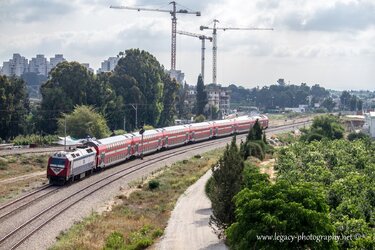
Hmmm... I wonder if this might not be better in colour. The scene is nice, but I think it might be stronger as-shot. The only nit I'll offer is that I wish you'd composed with the tracks just a bit more frame right so the in-use track didn't end on the vertical, but rather on the horizontal foreground.

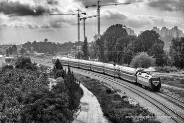
Okay... monochrome was the right call, the colour is a bit washed out looking. As for the tracks, these form a textbook-perfect leading line, and bringing them in from the edge of the foreground with the arc of the curve provides a great path for the eye to go right to the train.Hmmm... I wonder if this might not be better in colour. The scene is nice, but I think it might be stronger as-shot. The only nit I'll offer is that I wish you'd composed with the tracks just a bit more frame right so the in-use track didn't end on the vertical, but rather on the horizontal foreground.
Hi tirediron,
Thanks for the C&C.
I'm not sure if it would make a difference where the track ends (or in this case, really begins), but I'll play with it and see.
As far as the colour goes, here it is, let me know which you prefer.
View attachment 75211
I'm not a expert but I like it in B&W.
The most important thing in such a shot is to convey the sense of movement, the dynamics of a moving train. The exaggerated perspective helps a lot, that is why most photographers would stand besides the railway and shoot with a wide lense with the train looming. Here it was shot from the distance and looks like a miniature, almost a toy train.
Dominant lines of sight and diagonals need to work in unison to underline the dynamics of the shot. Here we have , in my view, unnecessary dominant contradicting verticals - cranes, that do not help.
I'd still like to see the train coming into the picture (More empty tracks on the left) rather than having the train almost leaving the picture. Unless thats what you wished to convey.
Also, this picture could have been made better with the use of a ND Grad i believe.
and while we're picking sides, i like the B&W better
Thanks tirediron.Okay... monochrome was the right call, the colour is a bit washed out looking. As for the tracks, these form a textbook-perfect leading line, and bringing them in from the edge of the foreground with the arc of the curve provides a great path for the eye to go right to the train.Hmmm... I wonder if this might not be better in colour. The scene is nice, but I think it might be stronger as-shot. The only nit I'll offer is that I wish you'd composed with the tracks just a bit more frame right so the in-use track didn't end on the vertical, but rather on the horizontal foreground.
Hi tirediron,
Thanks for the C&C.
I'm not sure if it would make a difference where the track ends (or in this case, really begins), but I'll play with it and see.
As far as the colour goes, here it is, let me know which you prefer.
View attachment 75211
I think the train needs more room to "move into". There is substantially more room, more frame,more visual weight, allotted to the area where the train "was". Overall, the composition doesn't feel very "right" to me. The large portion of the frame on the right hand side of the photo signifies that area being of greater importance than the left side, where the train is crowded into a single corner of the frame, and again, that does not seem quite "right" to me.

I prefer B/W